Size, position & one-handed use
Resize, float, and reposition the keyboard, per orientation and fold state.
Every height, width and gap on WM Keyboard is a slider rather than a fixed number. Shrink the keyboard toward one thumb, split it down the middle for a wide screen, or detach it into a floating panel. Sizing you set for portrait carries to the unfolded shapes by default, landscape starts from its own shorter board, and all three can override any of it, right down to scaling the whole keyboard at once.
Sizing the keys
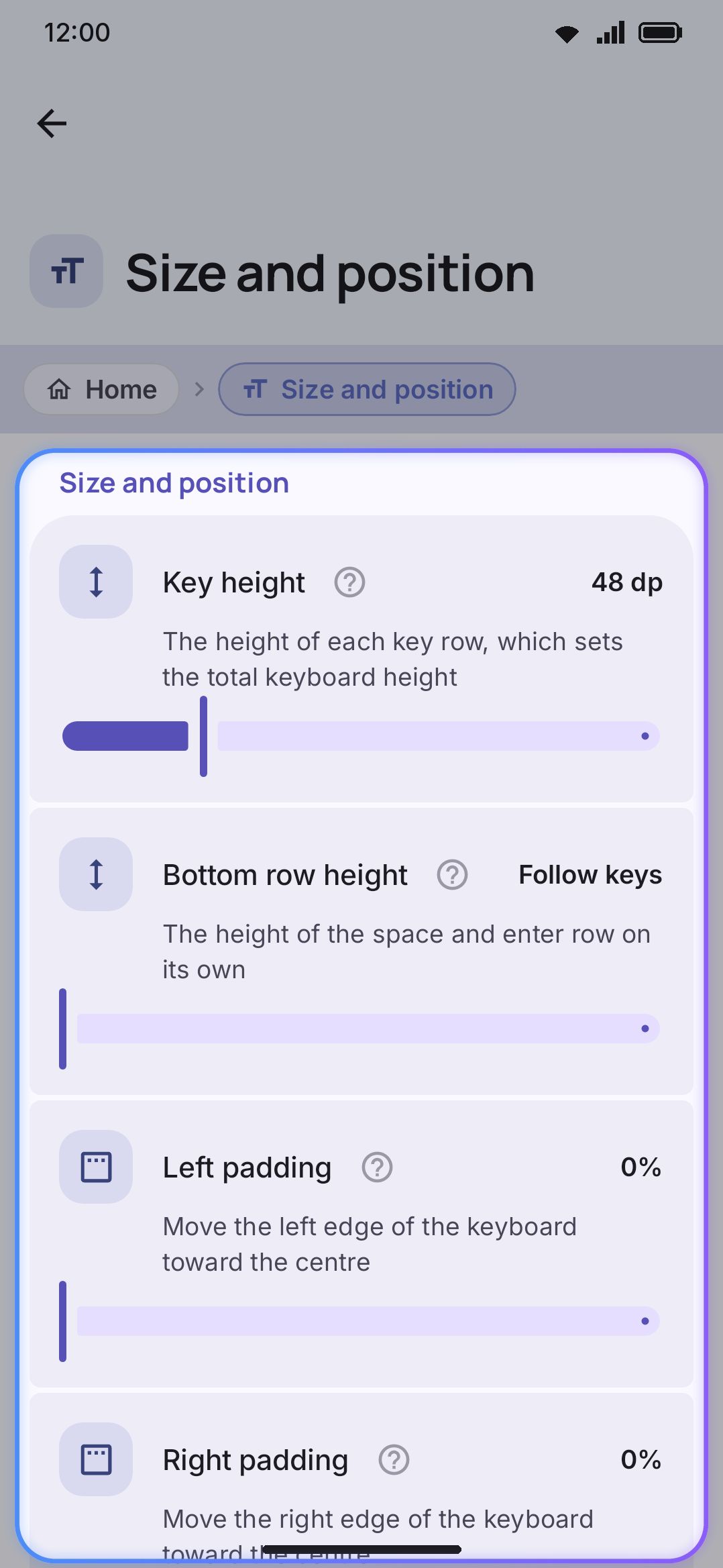
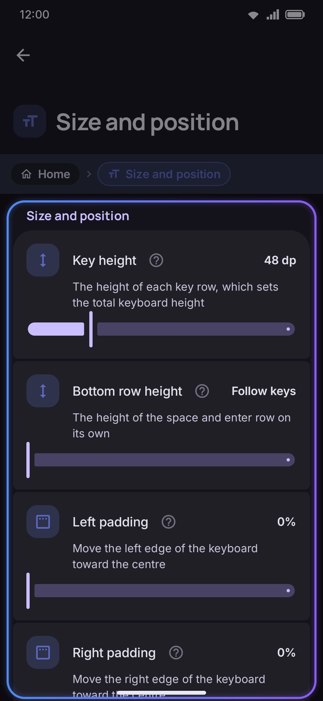
Section titled “Sizing the keys”Key height sets the height of every key row and, with it, the overall input height. It’s a slider from 32dp to 100dp, default 48dp. The emoji, clipboard and snippet panels scale with this value too, so a taller keyboard means taller panels.
Bottom row height gives the spacebar and Enter row its own height, independent of the letter rows: a slider from 0dp to 96dp. At 0, the default, it shows “Follow keys” and matches the letter rows. Raise it for an easier-to-hit spacebar without growing the whole keyboard. A custom layout that sets its own row heights ignores this slider.
Key spacing adjusts the gap around every key, from 0% to 200%, default 100%. Higher spreads the keys apart, and makes the keyboard a little taller, since the gap is part of each row. Lower packs them tighter.
WM Keyboard Layout & size Size and position Extend edge keys into the gapsExtend edge keys into the gaps is on by default. A row shorter than the keyboard, like QWERTY’s A to L row, leaves blank space at both ends. With this on, a tap in that space types the key at that end of the row: left of A types A, right of L types L. The bottom row reaches down the same way, over the padding and the gesture bar room under it, so a tap just below the spacebar types a space, and one below Enter or ?123 presses that key. It follows whatever bottom row the layer has, custom layouts included, unless you have moved a bar row below the keys. The keys stay the size and in the place they are drawn, only the area you can tap grows. Turn it off to make taps in the gap do nothing.
While WM Keyboard Layout & size Number row Number row is on (its own group at the top of this same screen, above Size & position), it has its own Number row height slider too: 32dp to 100dp, default 42dp, independent of the letter keys.
The size of the labels printed on the keys is a separate slider, Key label font size, under WM Keyboard Appearance Key label font size: 0.7× to 2.0×, default 1.0×. It isn’t part of this settings group, but the per-screen sizing below can still override it per screen shape.
Narrowing and repositioning it
Section titled “Narrowing and repositioning it”Keyboard width shrinks the keyboard horizontally instead of spanning the full screen, from 50% to 100%, default 100%. Below 100%, a Keyboard position choice appears (Left, Centre, or Right, with Centre the default) to pick which edge the narrowed keyboard hugs. This is a permanent dock. The slider’s own info text calls one-handed mode “a quick preset” that “replaces this value while it is on”, and it leaves the stored width and position alone.
Left padding and Right padding narrow the keys toward the middle for thumb reach, without docking to one side the way one-handed mode does. Each is a slider from 0% to 30%, default 0%, and both stack on top of keyboard width: the keyboard ends up at width × (1 − left − right) of the screen.
Two sliders rather than one so the margins don’t have to match. Set them equal for an even margin; set only the left one and the keys slide toward your right thumb without the keyboard docking to that edge.
Each padding is claimed at its own edge before Keyboard position gets a say, so a margin you asked for is there whichever edge the keyboard hugs. Position then distributes whatever space the width slider left over on top of it. On Centre, equal paddings give exactly the even margin they always did.
Bottom padding raises the whole keyboard away from the bottom edge and the gesture navigation bar, from 0dp to 160dp. Until you move it, the keyboard picks the amount itself: 32dp on Android 15 and up with gesture navigation, where the keyboard reaches down to the thin gesture handle, and 8dp with three-button navigation or on older versions, where the bar below is already tall enough to keep your thumb off the edge. The padding is counted from the top of the navigation bar, which the keyboard always keeps clear of on its own, so 0dp puts the space bar right on the bar, never under it or a row above it. Raise it if the bottom row feels cramped against the screen edge, or if you keep triggering system navigation by mistake. The slider runs so high because the inline Resize tool moves the same value, and that can push the keyboard a long way up the screen.
Hide the system keyboard bar removes the bar Android draws under the keyboard with gesture navigation, the one with a chevron that hides the keyboard and a button that switches to another keyboard. The keys then move down into the space the bar took, and automatic Bottom padding drops to the small 8 dp. If they still sit higher than you like, lower Bottom padding. The keyboard already has both buttons’ jobs covered: Back hides it, and the 🌐 key switches keyboards. It needs Android 16 or later, the first version that lets a keyboard ask for this; on older versions the switch is greyed out. It also needs gesture navigation: with three buttons, or on a phone whose system draws the bar into its own navigation bar, no keyboard can remove it, and the switch is greyed out there too. It is off by default.
Round top corners and Round bottom corners cut rounded corners out of the docked keyboard, from square (the default) up to 40dp, and the app shows through the cut. The top and bottom are set apart, and Which corners, shown once either one is round, picks which of the four corners they apply to. All four by default, so rounding only the top two means leaving the bottom at Square. Round bottom corners suit gesture navigation and a phone whose screen corners are round too. With the older three-button navigation bar, the bar sits below the keyboard and the bottom corners open onto the app above it. The floating keyboard and the television card have round corners of their own and ignore these.
Sizing each screen shape
Section titled “Sizing each screen shape”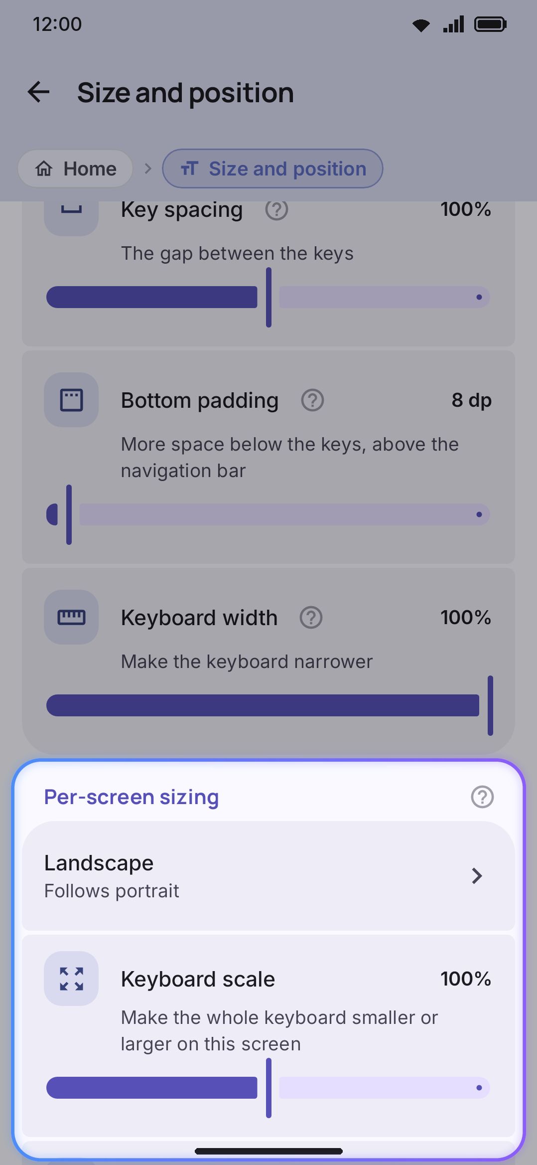
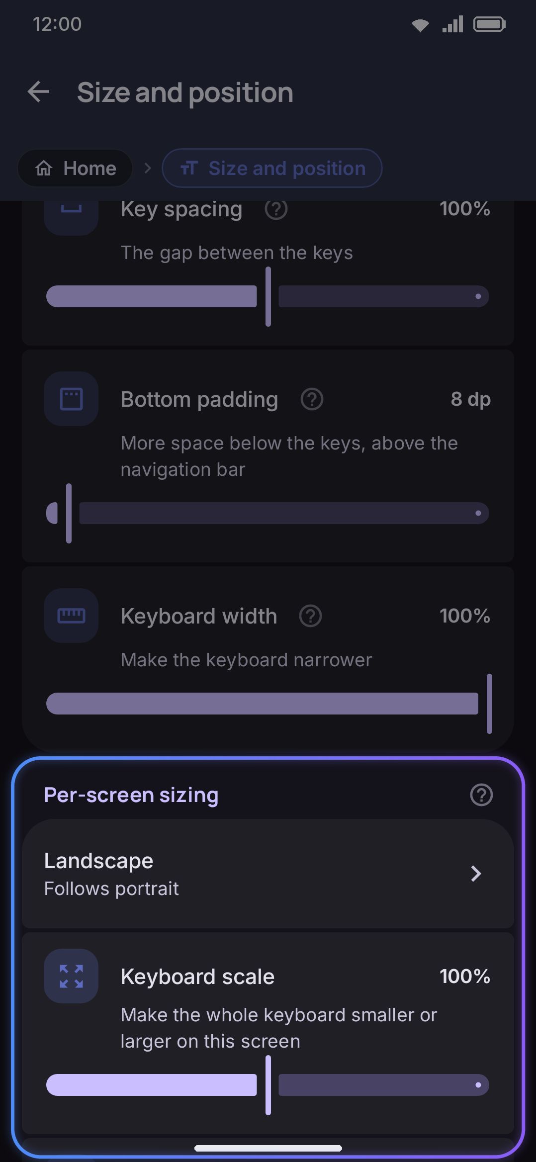
Portrait is the base size: everything in the two sections above. Three other screen shapes can each override any of it, namely Landscape, Portrait, unfolded and Landscape, unfolded. Whatever you leave untouched on an override follows portrait, so tuning one shape never means setting up the rest.
Landscape is the one exception, and it starts shorter rather than following portrait. A phone turned sideways keeps its width but has less than half the height, so a portrait-sized board would take the whole screen. See what landscape starts at below.
“Unfolded” isn’t read from a fold sensor. It’s decided by the screen’s smallest dimension being at least 600dp, checked live as the configuration changes. That deliberately reads a phone turned sideways as still “not unfolded”, since it’s wide but still a phone. A large screen counts as “unfolded” however it’s held, whether that’s an opened foldable’s inner display or a tablet that never folded at all. There’s no separate “folded” state in the code. Portrait’s values are what a folded or ordinary phone always used, which is why the settings screen’s own caption calls portrait your “folded” size.
Tap a shape’s row to expand its editor:
- Keyboard scale, a whole-keyboard multiplier from 50% to 150%. It exists only on these three override shapes; portrait has no base scale of its own. It multiplies key height and number row height together, so a foldable’s roomy inner display can run a smaller keyboard than its cover screen, or the reverse, without re-dialing each height by hand.
- Key height, Number row height (if the number row is on), Bottom padding, Keyboard width, Font size, Key spacing, Left padding, Right padding, Bottom row height, and, when width is under 100%, Keyboard position. Same ranges as their portrait counterparts above.
- Number row, the one override that isn’t a number at all. Landscape is what it’s there for: it has the least room for a sixth row and the most need for the keys underneath it, which is why sideways starts without it unless you’ve set the digit row by hand.
- One-handed mode on this screen and Split keyboard on this screen, which say whether this shape shows those modes at all. They default to the shared Portrait only and Split only on wide screens rules, and setting either one here wins over that rule for this shape alone.
- Follow portrait again, which appears only once a shape has at least one override set. It clears every override for that shape in one tap. On landscape that returns it to the landscape defaults below, not to your portrait numbers.
Everything in one-handed, split and floating below is set apart from these shapes. One-handed tuning and floating go by orientation only, portrait or landscape, and split is one switch for every shape.
What landscape starts at
Section titled “What landscape starts at”A phone turned sideways has roughly 360dp of height where portrait has 750dp. Left to follow portrait, the board came out taller than the window it had to fit in, and the bottom rows (the shift row and the spacebar) were drawn past the bottom of the screen and cut off. So landscape starts from its own numbers instead, measured against what Gboard does on the same screen:
| Portrait | Landscape | |
|---|---|---|
| Key height | 48dp | 33dp |
| Number row height | 42dp | 29dp |
| Number row | On | Off, unless you set it yourself |
| Toolbar height and tool width | 44dp / 38dp | 70% of whatever you’ve set |
That lands the whole board at a little over half the screen, leaving the app you’re typing into the rest. The digits aren’t lost with the row switched off: they stay as the small hint labels on the top letter row, and a long press still types them.
These are defaults, not limits. Anything you set for landscape in the per-screen editor above wins over all of them, and a theme that authors its own key height wins over them too. Turning the number row on by hand anywhere keeps it on sideways as well.
The toolbar is scaled rather than replaced, because it has no per-screen override of its own to escape to: a tool width you picked survives the rotation in proportion. Without it the tool circles stayed at their portrait size and ended up drawn larger than the keys underneath them.
A tablet in landscape isn’t affected by any of this. “Unfolded” is decided by the screen’s smallest dimension, so a tablet on its side is still at least 600dp tall and has the height to spare.
On a tablet
Section titled “On a tablet”A tablet gets a wider keyboard automatically, with nothing to set up. The screen’s smallest dimension decides which one you get, the same measurement per-screen sizing uses:
- under 600dp is a phone, and nothing below applies;
- 600dp to 767dp is a small tablet, which is also where an unfolded foldable lands;
- 768dp and up is a large tablet.
On either tablet size the letter rows gain a column on each side. That fills the width with keys instead of stretching the letters across it, and leaves the alphabet sitting in the middle where two hands reach it:
- Tab and \ flank the top letter row;
- Caps and Enter flank the home row, so Enter is under your right little finger rather than at the bottom corner;
- the number row gains a ` and takes over Backspace, which frees the shift row’s right end for a second Shift;
- the comma moves up beside the letters, and a real emoji key appears next to ?123;
- ← and → join the bottom row.
A large tablet goes further. The arrows sit right next to the spacebar, a second ?123 lands at the right end so you don’t have to reach back across ten inches for it, and the period joins the comma up on the letter rows. A small tablet keeps the period on the bottom row beside the spacebar, with the arrows after it, because a 7-inch tablet is still held and still thumb-typed.
Two settings also start from different defaults on a tablet, and only until you touch them:
- key height starts at 44dp (large) or 46dp (small) instead of 48dp, and number row height at 38dp or 40dp instead of 42dp, so six rows on a tablet take a smaller share of the screen than five do on a phone;
- the toolbar starts with seven pinned tools (large) or five (small) instead of three.
Change either of them and your value sticks on every device, tablet included.
The WM Keyboard Layout & size Number row Number row isn’t one of them any more. It’s on by default everywhere now, phones included, so there’s nothing left for a tablet to override.
The extra keys are added to whatever layout you’re using, so every shipped language gets them, and so does anything you build in the layout editor. Layouts that aren’t ordinary alphabetic grids are left alone: the Japanese flick pads, braille, morse, the Chinese shape and phonetic pads, and a handful of scripts whose grids have no shift key. If you’d rather a particular layout was left alone too, the editor has an Add tablet keys automatically switch for it.
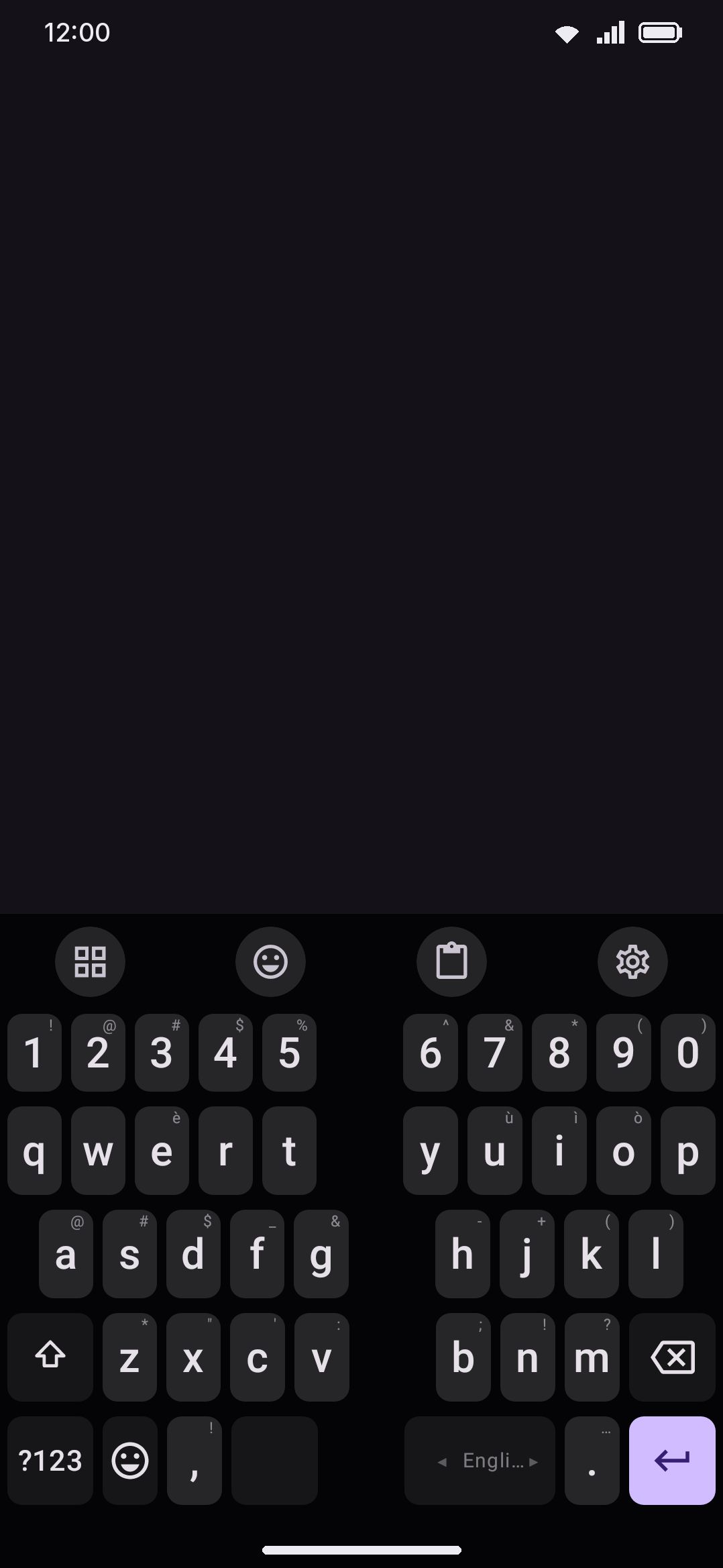
One-handed mode
Section titled “One-handed mode”One-handed mode shrinks the keyboard toward one edge for reach with a single thumb: Off (the default), Left, or Right. Unlike the per-shape sizing above, it’s tuned separately per orientation, Portrait and Landscape, rather than per fold state. A one-handed keyboard cares about which way you’re holding the phone, not whether it’s unfolded.
Each orientation gets its own three controls:
- Width is the keyboard’s share of the screen while one-handed is active, 40% to 85%. The default is 78% in portrait and 55% in landscape. Landscape starts narrower because a landscape keyboard is already very wide, so 78% there would barely help.
- Height scales the key height down for reach, 60% to 100%, default 100% in both orientations.
- Side is which edge it docks to, Left or Right, default Right in both orientations.
Portrait only, off by default and shown while the mode is on, holds one-handed mode back when the phone is sideways. The mode is one setting for both orientations, so a keyboard made small for a thumb in portrait stayed small after a turn, where the width is usually wanted for a split keyboard instead. With it on, the keyboard is one-handed upright and whole in landscape, and comes back as soon as you turn the phone back. The One-handed tool on the toolbar says so if you press it sideways.
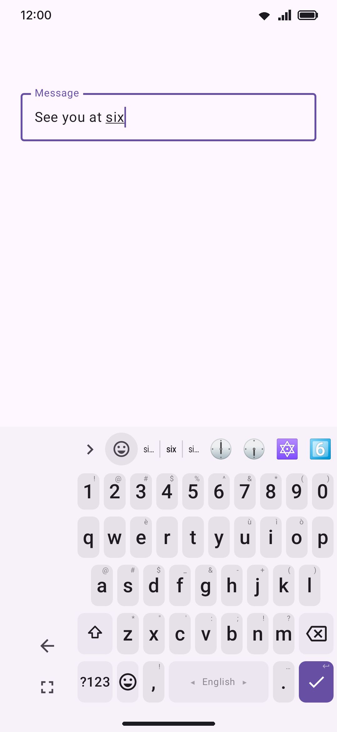
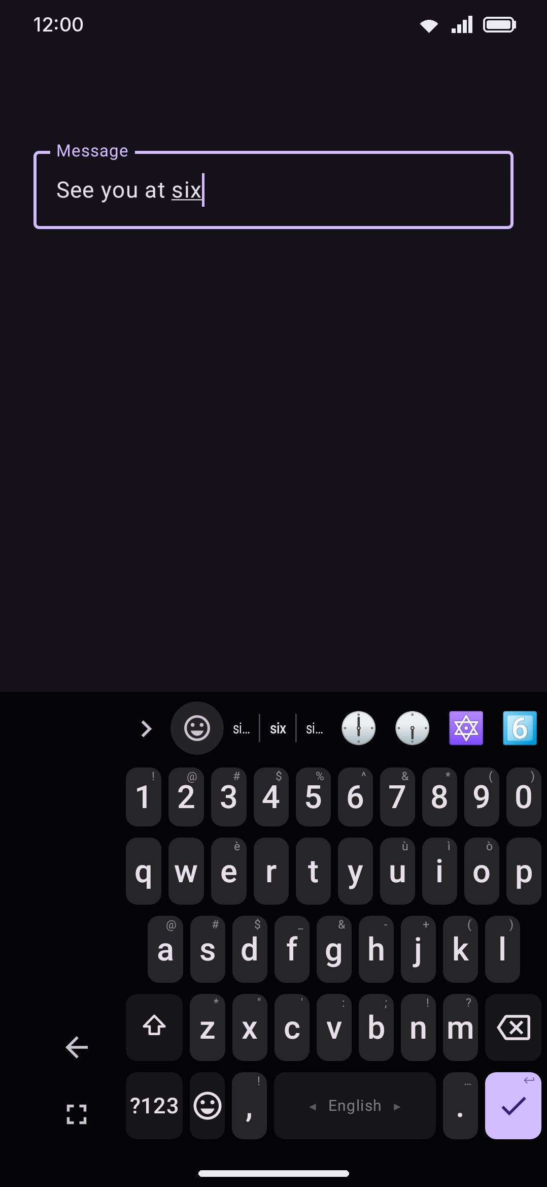
On the keyboard itself, a narrow rail fills the space one-handed mode leaves behind. It carries two buttons: an arrow that flips the keyboard to the other edge (live, and remembered as that orientation’s new default side) and a fullscreen icon that exits one-handed mode entirely.
Pin the One-handed tool to your toolbar and tapping it toggles one-handed on using that orientation’s preferred side, or off if it’s already on. It has no default letter binding on a physical keyboard, but the leader key still reaches it. Bind it a letter in Tool shortcuts list, or press T for the toolbox if you’ve pinned it there. See Hardware keyboards.
Splitting the keyboard in half
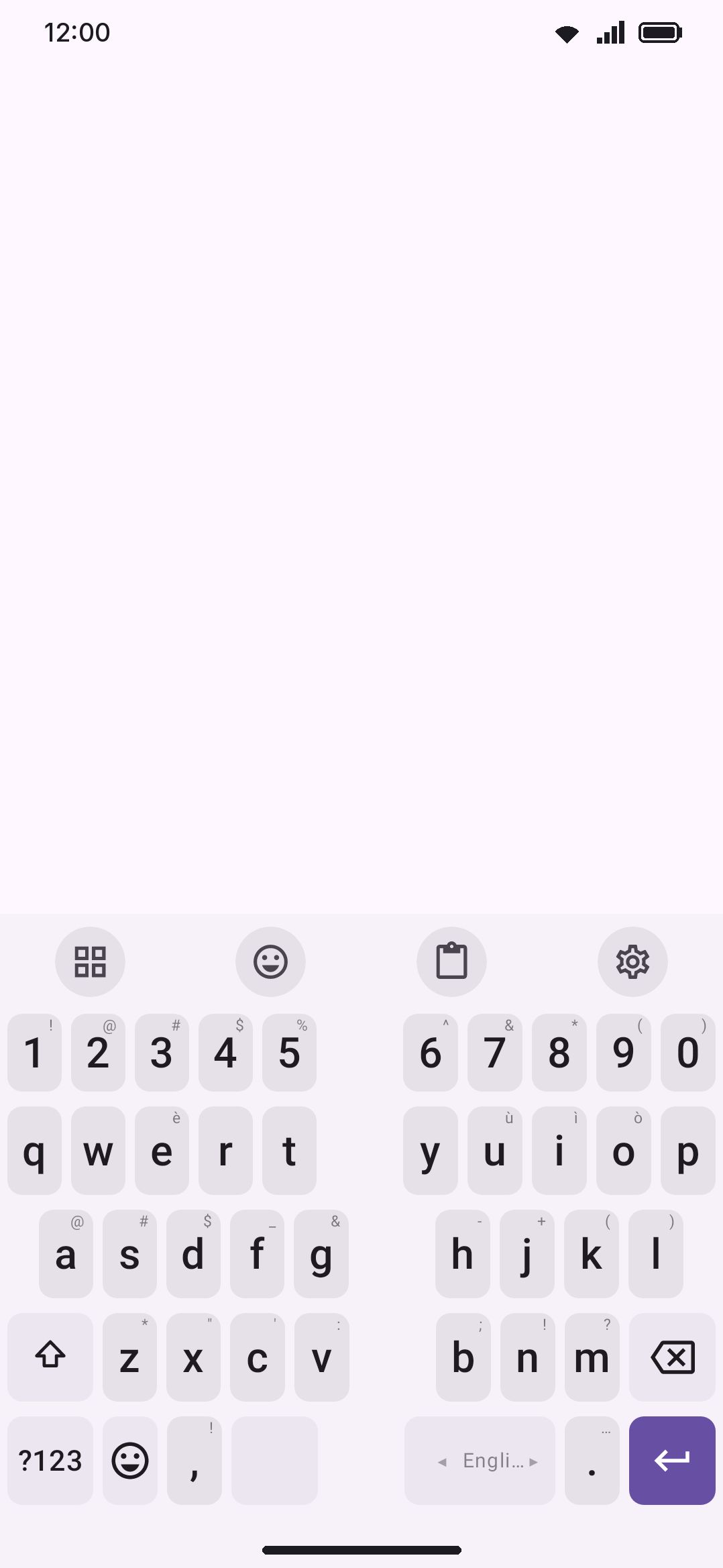
Section titled “Splitting the keyboard in half”Split keyboard divides every row down the middle with a gap between the halves, so your thumbs travel less on a wide screen. It’s most useful on tablets, foldables, and phones turned to landscape. It’s off by default, and turning it on reveals two more controls. Split gap runs from 5% to 40% of the keyboard’s width, default 12%; a bigger gap pushes the halves further toward the edges but narrows each key. By default the spacebar splits between the two halves along with everything else. Turn off Split the spacebar to keep it as one key that runs across the gap, so both thumbs land on it where they meet; the rest of the bottom row stays in its halves. Like one-handed mode, split is global rather than tied to a screen shape.
Split only on wide screens is the second one, off by default. Split is a single global switch, so turning it on in landscape leaves the keyboard split after you rotate back, where half a phone-width keyboard is close to unusable. Turn this on and the split only happens in landscape or on an unfolded screen. Portrait on an ordinary phone stays whole.
Both of these are shared rules. For a finer answer, each shape under per-screen sizing has its own One-handed mode on this screen and Split keyboard on this screen toggles. On a foldable, turning split off for Portrait, unfolded means the opened screen held upright gets one-handed mode alone instead of a one-handed split keyboard, while both landscape shapes stay split.
Floating the keyboard
Section titled “Floating the keyboard”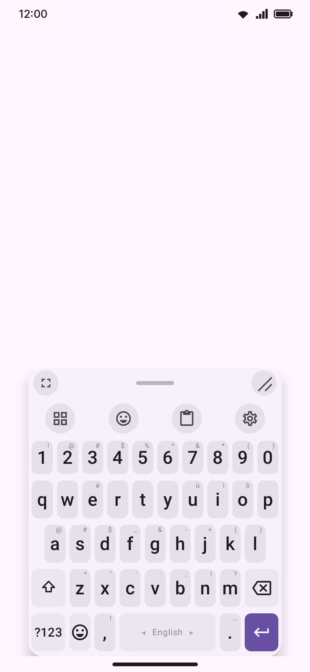
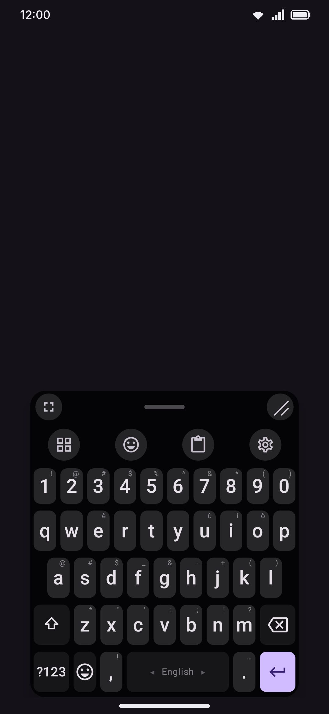
Floating keyboard detaches the keyboard from the bottom of the screen into a small, movable panel that hovers over whatever app is open. It’s off by default.
Portrait and landscape each remember their own answer, the way Gboard does. Floating keyboard is the portrait switch and Floating in landscape the sideways one, so you can float the keyboard sideways and keep it docked upright: turn the phone and it changes on its own. The Floating tool on the toolbar and the panel’s dock button change only the orientation the phone is held in. Until you change either one, landscape follows the portrait switch, so a keyboard that already floated before this setting existed still floats both ways.
With either one on, two sliders appear: Floating keyboard width, 240dp to 500dp, default 320dp, and Floating keyboard height, 60% to 160% of the keyboard’s normal height, default 100%. The resize grip on the panel drives the same two values, and shares the 240dp floor and the 60–160% height range. It doesn’t share the width ceiling: see the edge case below. A Reset the floating panel row appears below the sliders once you’ve moved or resized the panel, and puts its size and position back.
Handle bar position puts the handle bar Under the keys, the default, where your thumb already is, or Above the keys. The handle bar carries three controls, left to right:
- Dock button, a fullscreen icon that returns the keyboard to its normal, docked position.
- Drag pill. Dragging anywhere across the middle of the handle bar moves the panel, not just the small pill drawn there. Its position is saved as a fraction of the free space around it rather than as a pixel coordinate, so it survives rotation. By default that’s centered horizontally and pinned to the bottom of the available space. The panel stays where you let go of it.
- Resize grip, drawn as two short diagonal lines rather than a diagonal-arrows icon, deliberately, so it doesn’t read as another fullscreen button. Dragging it resizes width and height together, and width tracks your finger directly. With the bar under the keys, drag down to make the panel taller and up to shrink it. With the bar above the keys it runs the other way: drag up to grow the panel and down to shrink it. The panel’s top-left corner stays put while you resize, so the panel grows and shrinks from there instead of wandering across the screen.
Floating mode replaces the normal layout logic rather than combining with it. While it’s on:
- The one-handed rail and edge-docking don’t render. Your one-handed setting is untouched but has nothing to apply to.
- Keyboard width, keyboard position and bottom padding from the sections above don’t apply either. The panel’s size and position come entirely from its own width slider, drag position and resize grip.
- Split keyboard still works while floating. The two features aren’t mutually exclusive, since split rendering happens inside the same keyboard body the floating panel wraps.
Touches outside the panel pass straight through to the app underneath, and the keyboard forces full-screen (extract) mode off for as long as it’s floating. The panel also keeps clear of the navigation bar, so a handle bar parked at the bottom of the screen never sits on the gesture strip. Pin the Floating tool to your toolbar and tapping it toggles floating on or off for the orientation you’re in.
Keeping the keyboard on screen
Section titled “Keeping the keyboard on screen”Keep the keyboard on screen stops the keyboard from closing when the text field goes away. Off by default. With it on, the keyboard stays up after a field loses focus, over screens that have no text field at all, and across app switches, until you close it yourself. It works the same docked or floating: the switch decides whether the keyboard stays, not where it sits.
The point of it is apps that read keys without a text field. A notes app that asks you to press a hotkey combination, a terminal, a game with keyboard controls: normally the keyboard vanishes the moment you leave the text box, so there’s no way to send Ctrl+Shift+P from the screen. With this on, the keyboard stays and every key, modifier chords included, reaches the app as a key event. Letters and backspace arrive as key presses too, so plain typing into a fieldless screen works.
Closing it is deliberate rather than automatic. The Hide keyboard tool, a swipe down on the toolbar, and the Back button all put it away, and it stays away until you next tap a text field, at which point it comes up and sticks again. The keyboard never follows you onto the lock screen. An app that forces the keyboard closed every time it appears gets a few tries and then wins, so a badly behaved app can’t leave the keyboard flickering.
Pin the Keep on screen tool to your toolbar to toggle this directly. That tool and this row write the same setting.
Opening the keyboard without a text field
Section titled “Opening the keyboard without a text field”Keeping the keyboard on screen only helps once it’s open. To open it on a screen that has no text field to tap (a game, a terminal, a remote-desktop app, your home screen), turn on Floating keyboard button. Off by default.
A small round button with a keyboard on it floats over every app. Tap it and the keyboard opens right there, field or not, and stays open on that app’s screens until you close it. Keys reach the app as key presses, the same as with Keep the keyboard on screen. Switch to another app and the keyboard goes back to opening for text fields only.
While the keyboard is open the button stays, moved up to sit just above the keys, and its glyph changes to a keyboard with a down arrow. Tap it then and the keyboard closes. On a screen with no text field that is often the easiest way out, since such screens may not answer Back. The Hide keyboard tool and a swipe down on the toolbar still work too. When the keyboard closes, the button drops back to where you left it.
Open over WM Keyboard’s own settings, the keyboard brings up the settings’ test field, so you can type straight away and every row stays reachable above the keys.
- Drag the button to move it. It settles against the nearer side of the screen and stays where you left it. Dropped behind the open keyboard, it pops back up above it.
- Press and hold it to hide it until the keyboard next opens or closes, for when it covers something you need.
The button needs Android’s Display over other apps permission. Turning the switch on explains why and then opens Android’s page for it; until you allow it there, a row under the switch says what’s missing. The button is the only thing the keyboard draws with that permission (with the AI button, if that’s on), and it reads nothing from the screen. See Permissions.
Floating AI button
Section titled “Floating AI button”Floating AI button puts a second round button, with a sparkle on it, over every app, whether the keyboard is open or not. Tap it and an AI chat opens as a sheet over the bottom of the screen, with the app still showing above it. Off by default.
With screen reading on, the chat comes with the text that was on screen when you tapped: the article, the conversation, the error message. A line above the message box says so. View shows exactly that text, and Delete drops it. Nothing is sent until you ask something, and the Explain simply, Summarise and Hard words chips put a ready question in the box for you to send or change. Without screen reading the button still opens a chat, just with nothing attached, and a line under the model chips offers to turn it on.
Screen reading is an accessibility service, WM Keyboard AI screen reading, which you turn on in Android’s accessibility settings. The row Let the AI button read the screen appears under the switch until you do, and explains what it reads first. It reads the text of the app in front once per tap of the button and at no other time, skips password fields, and keeps nothing. It’s separate from the gestures service, which reads nothing. The Play Store build doesn’t contain it, so there the button always opens a plain chat. Screen reading picks up text, not pictures, so a photo on screen reaches the AI only through its caption or description.
To ask about one piece of text instead, select it in any app and pick Ask AI from the selection menu (on some phones it’s behind the menu’s three dots). The same sheet opens with just that text attached.
The chat uses the model picked in the AI tool, and the conversation is kept with your other chats, so it’s under Tools › AI › Chat afterwards. With an app lock on the AI chat, the sheet asks for it too. Tap above the sheet, the close button or Back to close it.
Drag the AI button to move it and press and hold to hide it, the same as the keyboard button. It needs the same Display over other apps permission.
The Keyboard controls notification (Settings › Notifications) does the same job from the notification shade, without the permission: tap it, or its Show button, and the keyboard opens over the app you were in once the shade closes. On Android 14 and later, where a swipe can clear even a permanent notification, the controls come straight back; turn them off in Settings › Notifications instead. The floating button is the more dependable of the two, because pulling the shade down briefly takes the screen’s focus away from the app, and a few apps answer that by closing the keyboard again.
Options
Section titled “Options”| Setting | Default |
|---|---|
| Key height | 48 dp |
| Bottom row height | Follow keys (0) |
| Left padding | 0% |
| Right padding | 0% |
| Key spacing | 100% |
| Extend edge keys into the gaps | On |
| Bottom padding | 32 dp (Android 15+ with gesture navigation) / 8 dp (three-button navigation, or older) |
| Round top corners | Square (0 dp) |
| Round bottom corners | Square (0 dp) |
| Which corners | All four |
| Keyboard width | 100% |
| Keyboard position | Centre |
| Keyboard scale (per screen shape) | 100% |
| Key height (landscape) | 33 dp |
| Number row height (landscape) | 29 dp |
| Number row (landscape) | Off |
| One-handed mode | Off |
| One-handed width | 78% portrait / 55% landscape |
| One-handed height | 100% |
| One-handed side | Right |
| Split keyboard | Off |
| Split only on wide screens | Off |
| Split gap | 12% |
| Split the spacebar | On |
| Floating keyboard | Off |
| Floating keyboard width | 320 dp |
| Floating keyboard height | 100% |
| Keep the keyboard on screen | Off |
Related but not part of this settings screen: Key label font size lives under Appearance settings. The Number row toggle itself, as opposed to its height slider above, lives in its own group at the top of this same Layout & size screen.
Accessibility settings has its own Key size and spacing shortcut that opens this exact screen. See Accessibility if you got here looking for bigger, easier-to-hit keys rather than a specific size.
Details & edge cases
Section titled “Details & edge cases”- Keyboard scale has no portrait equivalent. It exists only on the three override screen shapes. Portrait is sized entirely by its own key-height and number-row-height sliders, with no multiplier on top.
- Landscape’s defaults ignore your portrait key height, deliberately. A landscape phone is short whatever you like upright, so carrying a 64dp portrait key across would put the board back through the bottom of the window. The digit row is the one that does carry: it’s a row you asked for rather than a size the screen dictates.
- The key preview bubble gives way to the keys. The empty band the keyboard holds above itself for a top-row preview is taken out of the screen’s leftover space, never out of the board. On a screen too short for both, the board wins and the bubble gets whatever is left.
- A camera cutout at the side is board, not a gap. Turned sideways, a punch-hole camera sits beside the keys. The keyboard’s background runs to the screen’s edge under it, and only the keys move in, clear of the camera’s strip.
- No full-screen editor on a tablet or unfolded foldable. Android’s default gives a landscape keyboard a full-screen text box above it whenever the app doesn’t opt out, which on a big screen covers the app for nothing. WM Keyboard keeps that box to phones in landscape, like Gboard does; a floating keyboard never gets it at all.
- “Unfolded” is a screen-size check, not a fold-sensor read. Any device with a smallest dimension of 600dp or more counts, a tablet that never folds included. The label describes what the screen currently looks like, not the hardware.
- One-handed mode’s width setting is a live override, not a rewrite. Turning it on temporarily overrides the keyboard-width and position settings while active. Turning it off returns to whatever those were set to.
- A very wide screen can let the floating panel’s resize grip briefly exceed 500dp mid-drag. It snaps back to the 500dp maximum once you release it.
- No edition split. Every setting on this page (sizing, one-handed, split and floating) works identically on the full and lite builds.
For haptics and sound on each keystroke, see Sound & vibration. For the physical-keyboard leader key that can toggle one-handed, split and floating without touching the screen, see Hardware keyboards.