Layout & size
Every row on the Layout & size screen, covering the number row, the arrow keys row, key and row sizing, per-screen overrides, one-handed, split & floating, and the bottom-row emoji keys.
The Layout & size screen collects every physical dimension WM Keyboard’s keys can take: a digit row, key and row heights, per-screen-shape overrides, and one-handed, split and floating modes. The groups below appear in the same order they do on screen. This page is the field reference. The linked guides carry the reasoning and walk through each group in more depth.
You can reach this screen from the home screen’s Layout & size tile, from Accessibility → Touch → Key size & spacing, or from the Split, Floating, and One-handed toolbar tools’ own Options panels, each of which has an All layout & size settings row.
Options
Section titled “Options”A small keyboard preview stays pinned under the title while you scroll. Size and position (with the per-screen overrides) and One-handed, split and floating are pages of their own; Your layouts, Number row, Arrow keys row, Symbols layer, Numerals and Bottom-row keys stay on the hub.
Your layouts
Section titled “Your layouts”One toggle per layout you’ve made or installed yourself, each subtitled with the dictionary it types with, for example “Types with the English · QWERTY dictionary”. It’s your own layouts specifically: an edited copy of a shipped layout stays attached to its original language instead of showing here twice, and a secondary layout is left out too, since it can’t be switched on at all. Turning one on is gated on it validating; switching one off never is. On a fresh install, with nothing of your own yet, the group has no toggles.
A Key layouts row follows, opening WM Keyboard Layout & size Key layouts, documented in full on Custom layouts & the layout editor. Its subtitle reads “Make your own key grid, or start from a built-in one” before you’ve built anything, and “Edit, add and delete layouts” after. A Download more row closes the group, opening the layout add-on repositories.
Number row
Section titled “Number row”| Setting | Control | Range | Default |
|---|---|---|---|
| Number row | Toggle | On / Off | On |
| Number row height | Slider | 32–100 dp | 42 dp (40 small tablet / 38 large) |
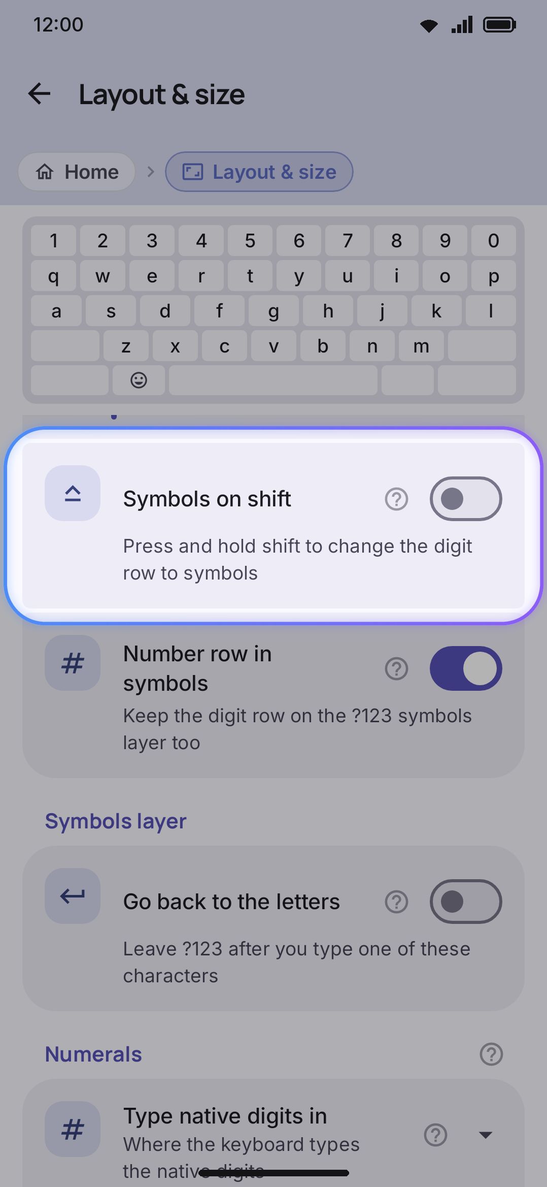
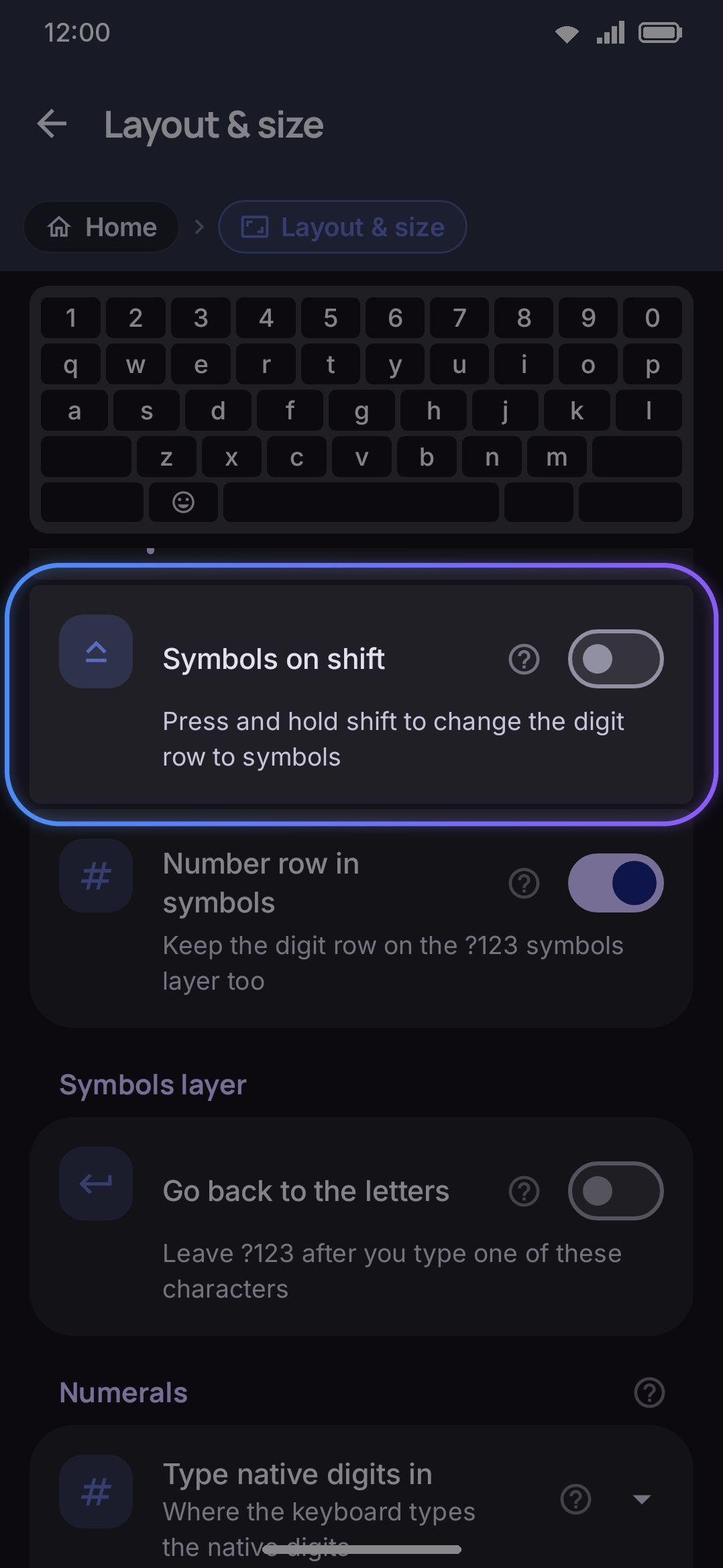
| Symbols on shift | Toggle | On / Off | Off |
| Number row in symbols | Toggle | On / Off | On |
| Symbol row on number pads | Toggle | On / Off | On |
Number row adds a dedicated 1–0 row above the letters, so digits don’t need a long-press. It’s on out of the box on every device, phones included. Turning it on drops the top row’s digit long-press alternate, which is redundant once the row exists. The four sub-settings only appear once Number row is on. Number row height sizes the digit row independently of the letter keys. Symbols on shift swaps the row to = \ < > [ ] { } | ~ while Shift is held, instead of showing digits. A tap of Shift, or the automatic capital at a sentence start, leaves the digits in place. Number row in symbols keeps the digit row on the ?123 layer too, and turning it off shrinks the keyboard by a row there. Symbol row on number pads keeps that same row over the keypad you get in a number, phone, date or time field, where it carries symbols rather than a second set of digits: + * # , ; ( ) - / . on a phone field, + - * / = ( ) % : . on the others. Turn it off for the bare keypad, one row shorter; the digit row over the letters is untouched either way.
The tablet heights in the table are what you get until you touch the slider. Set it yourself and your value applies on every device. See On a tablet. If you want the digit row on some screen shapes but not others (landscape is the usual one), Per-screen sizing below has its own Number row toggle per shape.
See Number row and numerals for the full walkthrough.
Arrow keys row
Section titled “Arrow keys row”| Setting | Control | Range | Default |
|---|---|---|---|
| Arrow keys row | Toggle | On / Off | Off |
| Arrow order | Drag list | Left, Up, Down, Right in any order | Left, Up, Down, Right |
Arrow keys row adds a row of four arrow keys under the spacebar, so you can move the cursor without a toolbar tool or a drag on the spacebar. Each key sends a real arrow key press, and holding one keeps moving the cursor. The row shows on every layer except a secondary layout, which stays exactly as its author built it. It takes the height of the number row (the Number row height slider above, or a screen shape’s own override), so the resize handle and one-handed mode scale it with the rest of the keyboard, and the keyboard grows by that much. Arrow order appears once the row is on: drag the handles to put the four keys in the order you want, left to right.
Symbols layer
Section titled “Symbols layer”| Setting | Control | Options | Default |
|---|---|---|---|
| Go back to the letters | Toggle | On / Off | Off |
| Characters that go back | Text field (shown when the toggle is on) | Any characters | !?.,;: |
| Go back after a space | Toggle | On / Off | Off |
Go back to the letters returns the keyboard to the letter keys right after you type one of the listed characters on the ?123 layer, so a single full stop doesn’t strand you in the symbols. It’s the same idea as the emoji panel’s Return to keyboard after inserting. It’s off by default, because plenty of people open ?123 to type a run of punctuation.
Characters that go back is the list itself. Type the characters you want, with or without spaces between them. Duplicates and spaces are dropped on save, and an empty box falls back to ! ? . , ; :. Digits are deliberately out of that default, since typing “12” is exactly when you want to stay put.
Only single-character keys count, so a .com key or an emoticon key never triggers the return. Long-press alternates do, since they insert a single character too. Both symbol pages are covered, so a character typed on the second page returns to the letters the same way.
Go back after a space returns to the letters when you press the spacebar on either symbol page, so “at 5 pm” doesn’t need an ABC press between the number and the word. A space can’t go in the character list above (spaces are dropped from it), so it has its own toggle, and it works whether Go back to the letters is on or off. It’s off by default, so a phone number or a time typed with spaces stays on ?123.
Numerals
Section titled “Numerals”| Setting | Control | Options | Default |
|---|---|---|---|
| Type native digits in | Choice | Text fields / Everywhere / Display only | Text fields |
Type native digits in controls where a language’s native digit glyphs get committed, not which glyphs it uses. That per-language picker (Auto, or a forced script like Arabic-Indic or Bengali) lives on each language’s own screen under Languages. Text fields, the default, keeps plain 0–9 in number, phone, date and time fields so they stay machine-readable, and types native digits everywhere else. Everywhere commits native digits in those fields too. Display only draws the native glyphs on the keys but always inserts 0–9.
Size and position
Section titled “Size and position”| Setting | Control | Range | Default |
|---|---|---|---|
| Key height | Slider | 32–100 dp | 48 dp (46 small tablet / 44 large) |
| Bottom row height | Slider | 0–96 dp | 0 dp (“Follow keys”) |
| Left padding | Slider | 0–30% | 0% |
| Right padding | Slider | 0–30% | 0% |
| Key spacing | Slider | 0–200% | 100% |
| Extend edge keys into the gaps | Toggle | On / Off | On |
| Bottom padding | Slider | 0–160 dp | 32 dp (Android 15+ with gesture navigation) / 8 dp (three-button navigation, or older) |
| Hide the system keyboard bar (Android 16 and up) | Toggle | On / Off | Off |
| Round top corners | Slider | Square, or 1–40 dp | Square |
| Round bottom corners | Slider | Square, or 1–40 dp | Square |
| Which corners (shown once either corner slider is above Square) | Filter chips | Top left, Top right, Bottom left, Bottom right | All four |
| Keyboard width | Slider | 50–100% | 100% |
| Keyboard position (shown only below 100% width) | Choice | Left / Centre / Right | Centre |
These sliders set the everyday shape of the keyboard: how tall the keys and the space/enter row are, how much air sits around each key and along the edges, and whether the keyboard docks narrower than the full screen width. For the full breakdown of each one, including how they interact with one-handed mode and split, see Size, position & one-handed use.
Once you’ve moved anything in this group, a Reset size and position row appears at the bottom of it. It asks first, then puts every slider here back at once. Two sliders it reaches that don’t sit in this group come with them: Number row height from the top of this screen, and Key corner radius over on Appearance, which is sizing even though it doesn’t live here. The per-screen overrides below are left alone.
Per-screen sizing
Section titled “Per-screen sizing”The Size & position values above are your portrait sizes, and the in-app caption calls them your “portrait (folded)” sizes. Three more screen shapes can each override any of them, plus the Number row toggle from the top of the screen, or scale the whole keyboard at once: Landscape, Portrait, unfolded, and Landscape, unfolded. A shape counts as “unfolded” by a live check on the screen’s smallest dimension (≥ 600 dp) rather than a fold-sensor read, so a tablet that never folds still counts. Each row reads “Follows portrait” until you set an override, and its own key height and width once you have. Tap a row and its editor unfolds in place:
| Field | Range | Falls back to |
|---|---|---|
| Keyboard scale | 50–150% | 100% |
| Key height | 32–100 dp | this screen’s base Key height (48 dp); 33 dp on landscape |
| Number row height (only if Number row is on) | 32–100 dp | base Number row height (42 dp); 29 dp on landscape |
| Bottom padding | 0–160 dp | base Bottom padding |
| Keyboard width | 50–100% | base Keyboard width (100%) |
| Font size | 0.7×–2.0× | global Key label font size (1.0×) |
| Key spacing | 0–200% | base Key spacing (100%) |
| Left padding | 0–30% | base Left padding (0%) |
| Right padding | 0–30% | base Right padding (0%) |
| Bottom row height | 0–96 dp | base Bottom row height (0, “Follow keys”) |
| Number row | On / Off | base Number row (On); Off on landscape unless you set the base toggle yourself |
| Keyboard position (only if resolved width < 100%) | Left / Centre / Right | base Keyboard position |
| One-handed mode on this screen | On / Off | On, or Off on the two landscape shapes while Portrait only is on |
| Split keyboard on this screen | On / Off | On |
The last two are gates rather than switches: one-handed mode and split stay one setting each, and these say whether this screen shape shows them. Turn Split keyboard on this screen off on Portrait, unfolded and an opened foldable held upright gets one-handed mode on its own, while landscape keeps the split. They also beat Portrait only and Split only on wide screens for this shape, so a landscape shape can allow one-handed mode even with Portrait only on.
A Follow portrait again row appears at the bottom of the editor once any field is set, clearing the whole override back to “Follows portrait” in one tap. On landscape that returns the shape to its own defaults rather than to your portrait numbers.
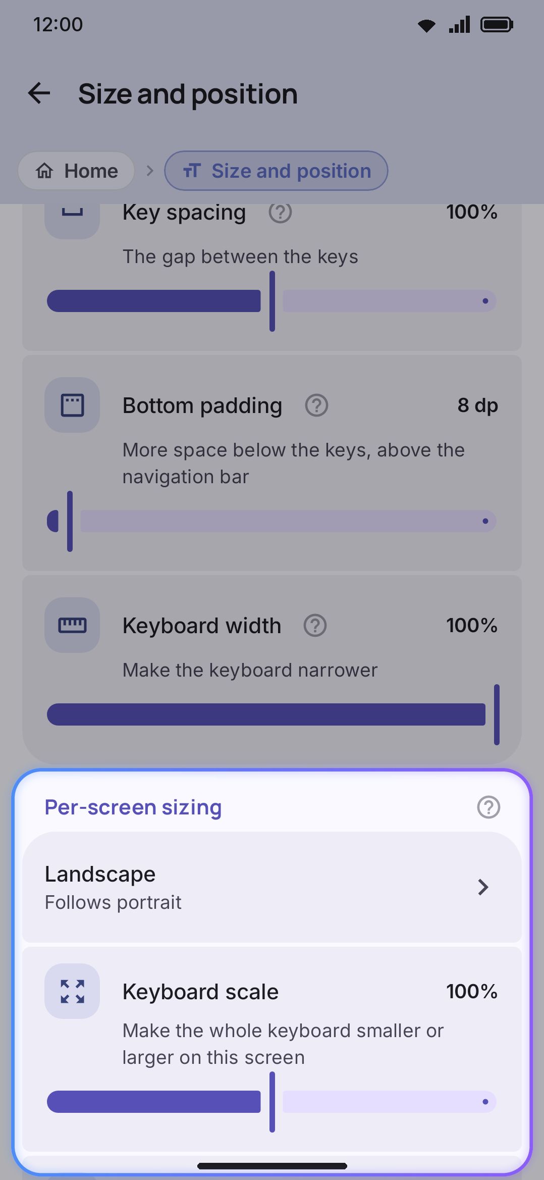
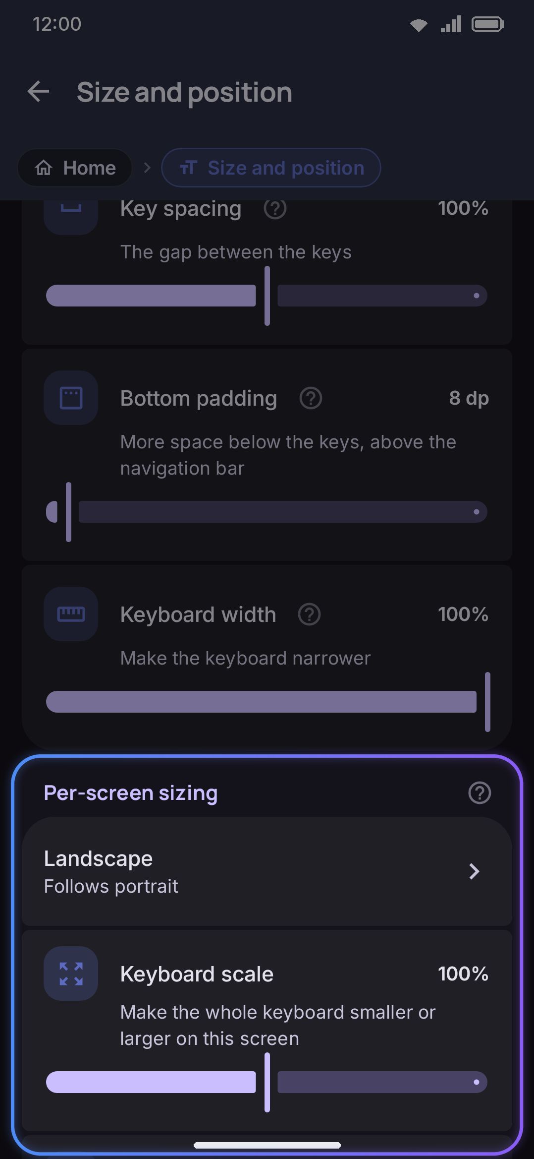
Keyboard scale has no portrait equivalent. It’s a whole-keyboard multiplier that only exists on these three override shapes. It earns its keep on a foldable, whose roomy inner display often wants a smaller keyboard than the cover screen. Font size here is the same field as Key label font size under Appearance settings. This screen doesn’t own it, but you can still give it a different value per screen shape from here. Number row is the one override that isn’t a number, and landscape is what it’s for: least room for a sixth row, most need for the keys under it.
Landscape is also the one shape that doesn’t fall back to portrait for the three fields marked above. A phone on its side has under half the height it has upright, so a portrait-sized board overflowed the window and had its bottom rows cut off; sideways starts from its own shorter numbers instead, and the toolbar is scaled to 70% to keep the tool circles smaller than the keys. See What landscape starts at. Setting a field here still wins over all of it.
One-handed, split and floating
Section titled “One-handed, split and floating”| Setting | Control | Range | Default |
|---|---|---|---|
| One-handed mode | Choice | Off / Left / Right | Off |
| Portrait only (shown only when One-handed mode is not Off) | Toggle | On / Off | Off |
| Portrait · width (shown only when One-handed mode is not Off) | Slider | 40–85% | 78% |
| Portrait · height (shown only when One-handed mode is not Off) | Slider | 60–100% | 100% |
| Portrait · side | Choice | Left / Right | Right |
| Landscape · width (shown only when One-handed mode is not Off) | Slider | 40–85% | 55% |
| Landscape · height (shown only when One-handed mode is not Off) | Slider | 60–100% | 100% |
| Landscape · side | Choice | Left / Right | Right |
| Split keyboard | Toggle | On / Off | Off |
| Split only on wide screens (shown only when Split keyboard is on) | Toggle | On / Off | Off |
| Split gap (shown only when Split keyboard is on) | Slider | 5–40% | 12% |
| Split the spacebar (shown only when Split keyboard is on) | Toggle | On / Off | On |
| Floating keyboard | Toggle | On / Off | Off |
| Floating keyboard width (shown only when Floating keyboard is on) | Slider | 240–500 dp | 320 dp |
| Floating keyboard height (shown only when Floating keyboard is on) | Slider | 60%–160% | 100% |
| Keep the keyboard on screen | Toggle | On / Off | Off |
| Floating keyboard button | Toggle | On / Off | Off |
| Floating AI button | Toggle | On / Off | Off |
| Let the AI button read the screen (shown only when the AI button is on and its accessibility service is off; not in the Play Store build) | Link | Explains, then opens Android’s accessibility settings | |
| Allow display over other apps (shown only when a floating button is on and Android hasn’t allowed it yet) | Link | Opens Android’s “Display over other apps” page |
One-handed mode tunes separately per orientation. The rail’s arrow inside the keyboard flips the side, and it remembers the answer here for whichever orientation you’re in. Portrait only switches the mode off while the phone is sideways and back on when it is upright again, so a thumb-sized portrait keyboard and a split landscape one can coexist. Split divides every row into left and right halves with a gap between them, and Split only on wide screens holds that back until you’re in landscape or on an unfolded screen, so rotating out of landscape doesn’t leave a portrait phone split in two. Floating detaches the keyboard into a movable, resizable panel. While it’s active it replaces the width, position and bottom-padding logic above, though split still works alongside it. Keep the keyboard on screen stops the keyboard from closing when a text field loses focus, so it stays up over screens with no field at all until you hide it yourself. See Keeping the keyboard on screen for what reaches the app and how to close it.
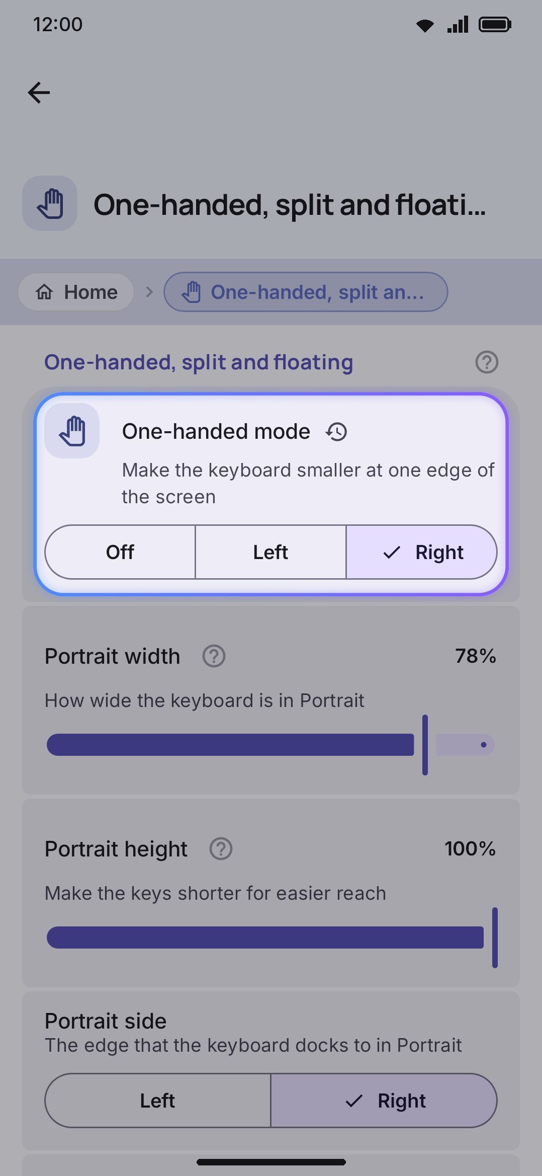
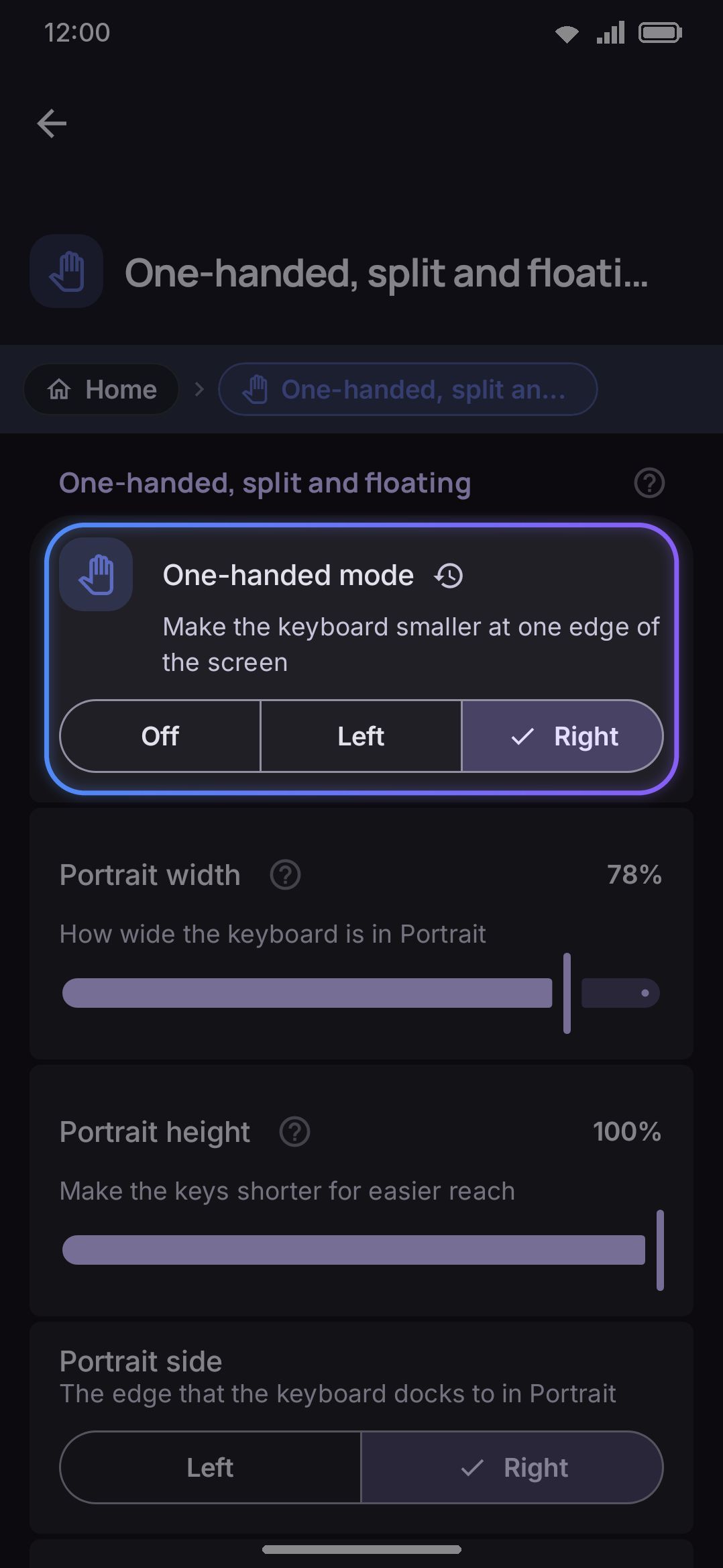
Full detail on all three (plus the floating panel’s drag pill and resize grip) is on Size, position & one-handed use.
Bottom-row keys
Section titled “Bottom-row keys”| Setting | Control | Default |
|---|---|---|
| Comma key opens emoji | Toggle | Off |
| 1234 key on the symbol pages | Toggle | Off |
| Show the 🌐 key | Toggle | On |
| Emoji key instead of 🌐 | Toggle | On |
| Swap the comma and 🌐 keys | Toggle | On |
| Keep the 🌐 key in one place | Toggle | On |
| Ignore 🌐 right after typing | Slider, Off or 50–1000 ms | Off |
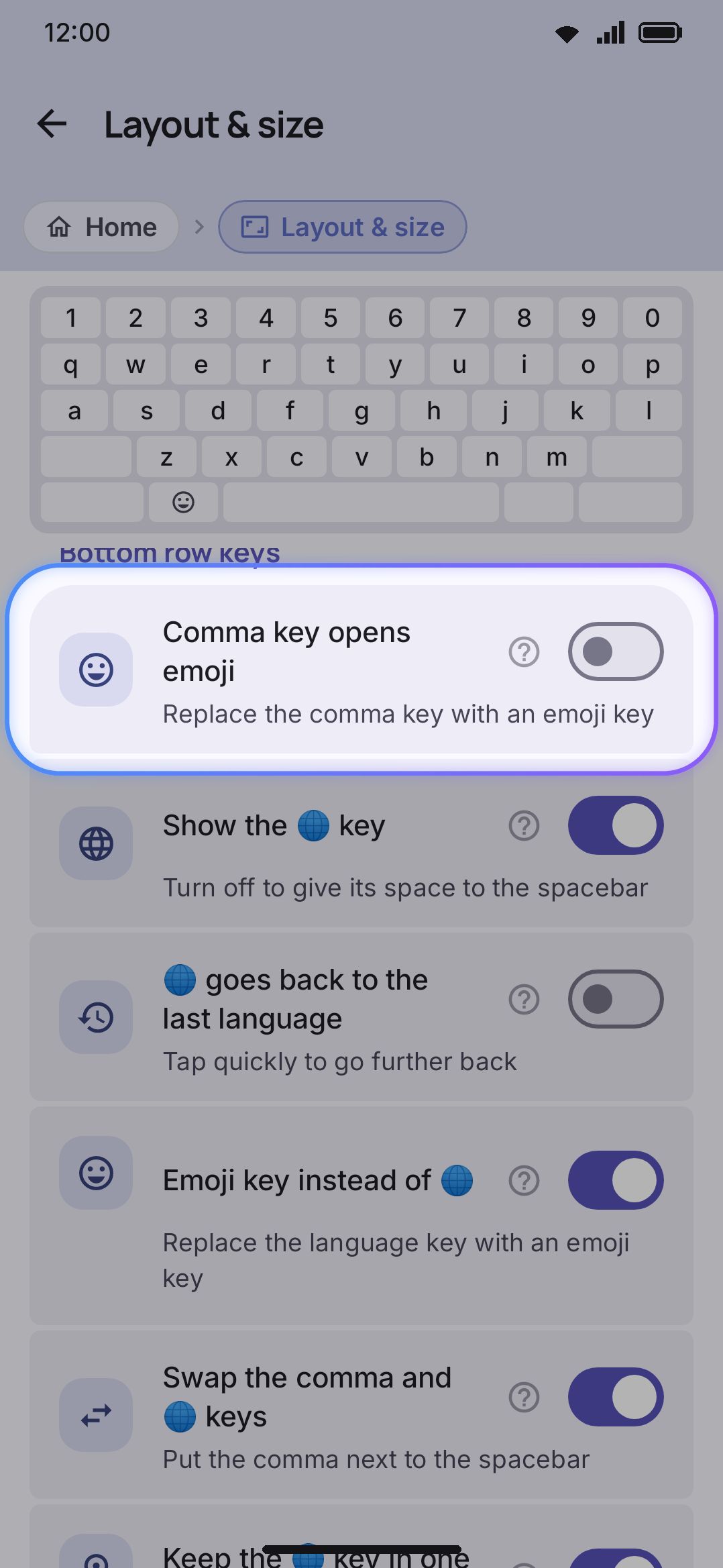
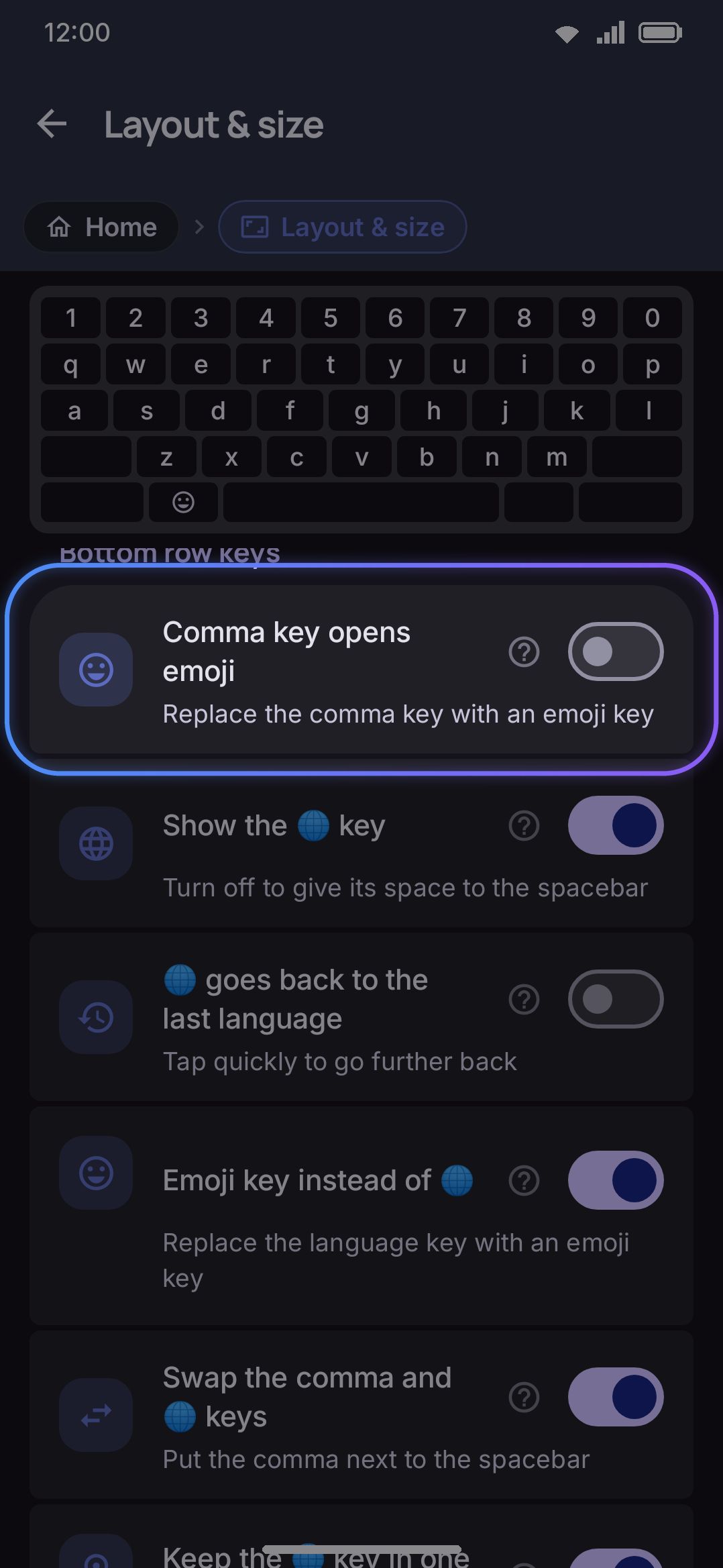
Emoji key instead of 🌐 is on by default. The bottom-row 🌐 key opens the emoji panel instead of switching language, and language switching moves to a spacebar swipe (Language, by default). Comma key opens emoji takes over the comma key the same way, with comma demoted to a long-press alternate. Turning it on also removes the emoji tool from the toolbar, since the key is meant to replace it.
1234 key on the symbol pages is off by default. Turn it on and both symbol pages get a 1234 key straight after ABC, as in Gboard, which opens the number pad over the current field. The spacebar gives up one key’s width to make room, so the row keeps its length. A layout that already has a number pad key, a symbol page you arranged by hand in the layout editor, and a spacebar too narrow to give up the width are all left as they are.
Swap the comma and 🌐 keys is on by default. Without it the bottom row reads ?123 · , · 🌐 · space · . · ⏎; with it the two keys either side of the spacebar trade places, so it reads ?123 · 🌐 · , · space · . · ⏎. It’s a straight positional swap and it runs after the emoji rewrites, so whichever of the two you turned into an emoji key travels with its slot. On the default settings that puts the emoji key in the outer position and the comma next to the spacebar. It applies to every layout, imported and custom ones included, and to the symbol layers too, so the row doesn’t reshuffle on the way into ?123.
Keep the 🌐 key in one place is on by default. Layouts don’t all agree on where the 🌐 key goes: many imported ones, most of the converted Keyman layouts among them, put it at the far left, straight after ?123, or after the spacebar. With this on, the key moves to the slot the built-in layouts use, so it sits under the same spot on the screen in every language you switch between. That slot is measured as a share of the row, not counted in keys: the key starts a quarter of the way along the row and is a tenth of it wide, or, with Swap the comma and 🌐 keys on, it starts at 15% with the comma after it. The keys before it get wider or narrower to fill the space up to it, the spacebar grows or shrinks to fit, and every other key keeps its width and its order. When nothing sits before the key, the key itself widens to reach its slot, so a thumb aimed at the usual place still lands on it. A row where the move would squeeze keys to under half their width, stretch them past two and a half times it, or leave the spacebar under a fifth of the row is left as it is, and so is a row with a key that spans two rows. The built-in layouts already have the key in its slot, so nothing about them changes. A second layout you open from a key is always drawn as its author made it, and so is the expanded tablet grid.
Show the 🌐 key is on by default. Turn it off and the key is gone from the bottom row of every layout, on the symbol layers too, and so is the emoji key that Emoji key instead of 🌐 puts in its place. The spacebar takes its width, so the row stays the same length. While the key is hidden, Emoji key instead of 🌐, Swap the comma and 🌐 keys and Keep the 🌐 key in one place have nothing to change and are greyed out. Language switching stays on the spacebar: a quick swipe does it by default. See Switching languages.
None of these five settings touches a layer you’ve laid out by hand in the layout editor. Moving or changing a key there that one of them had moved or changed turns on that layer’s Keep this bottom row as it is here switch, and from then on the keyboard draws that row exactly as the editor shows it. See The bottom row and its settings.
Ignore 🌐 right after typing is off by default. Set a time and a tap on 🌐 that comes sooner than that after a typed key (a letter, space, backspace or enter) does nothing, so a thumb that misses the comma or the spacebar mid-word no longer changes the language. Holding 🌐 still opens the picker. Greyed out while the key is hidden. See Switching languages.
See Switching languages and Opening the emoji panel for what each toggle changes in daily use.
Details & edge cases
Section titled “Details & edge cases”- Both emoji-key toggles sit out the expanded tablet grid. A tablet-width grid draws a real emoji key of its own, so applying either toggle there would give you two, and turning the globe into an emoji key would take language switching off the board entirely. On that grid the keyboard ignores both switches, whatever they say here.
- Bottom padding goes a lot higher than it looks like it needs to. The slider runs to 160 dp because the inline Resize tool drives the same value, and dragging the keyboard well up the screen has to land somewhere.
- Per-screen sizing has no “folded” shape. Portrait itself is the base folded size. “Unfolded” is decided live by screen width rather than a fold sensor, so it can flip mid-session on a foldable device.
- “Type native digits in” is not the digit-glyph picker. Which glyphs a language’s digits use (Latin, Arabic-Indic, Bengali, Devanagari and so on) is set per language under Languages. This screen only controls where the resulting glyphs get committed.
- Bottom row height’s 0 value reads as “Follow keys,” not “0 dp.” It’s the default, and it means the space/enter row matches the letter-key height exactly.
- Bottom padding’s default depends on your Android version and navigation mode. It’s 32 dp on Android 15 and up with gesture navigation, where the IME window draws behind the gesture bar and the system’s hide-keyboard and switch-keyboard buttons, and 8 dp with three-button navigation or on older versions.
- Hide the system keyboard bar needs Android 16. With gesture navigation, Android draws a bar under the keyboard with a hide-keyboard chevron and a switch-keyboard button. Android 16 is the first version that lets a keyboard ask for that bar to go, so the switch is greyed out on older versions. It is greyed out as well with three-button navigation, and on a build that draws the bar into the system navigation bar, because no keyboard can remove it there. With it gone, Back hides the keyboard, the 🌐 key changes keyboards, and the keys move down into the bar’s space while still clearing the gesture handle. Automatic Bottom padding drops to 8 dp then; set it lower still if you want the space bar nearer the edge.
- Per-screen overrides don’t reset one field at a time. Follow portrait again clears a whole shape instead. Characters that go back has no restore button either, since it’s a plain text field: empty it and the built-in
!?.,;:comes back. Everything else on this screen has the usual per-setting restore button. - No edition differences. Every control on this screen behaves the same on the full and lite builds.
Related pages
Section titled “Related pages”- Size, position & one-handed use: the full guide to Size & position, per-screen sizing, one-handed mode, split and floating, with screenshots of each in action.
- Key basics: the Number row and Numerals groups, explained alongside the rest of everyday typing.
- Switching languages and Opening the emoji panel: what the two Bottom-row keys toggles change.
- Appearance settings: Key label font size, the same field this screen’s per-screen Font size override adjusts.
- Accessibility: the Key size & spacing shortcut that also opens this screen, plus its own touch and vision accommodations.