Custom layouts & the layout editor
Edit any keyboard layout visually, or as raw JSON, and share the result.
A layout is the key grid itself: which key sits where, what it types, what its long-press alternates are. WM Keyboard ships 1,732 of them, and every one is editable: rearrange a few keys, add a Ctrl key for a terminal app, or build a language layout from scratch, then share the result as a file.
Editing a layout
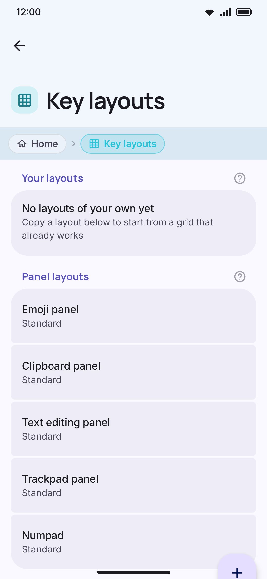
Section titled “Editing a layout”Layouts of your own are always listed, on or off, and the switch at the start of each row’s buttons turns one on or off without leaving the screen. A layout of your own also shows on the Layouts shelf of its language under Languages, next to the shipped ones, so either place works. Shipped ones appear here once you’ve turned them on under Languages. There’s no edit button: tap the row itself and the visual editor opens. The grid renders with your actual theme, key shape, and font, so what you edit is what you’ll type on. The three icon buttons at the end of a row do something else, in this order: export the layout to a file, duplicate it, and delete it (or, on a shipped layout you’ve edited, reset it).
Each layout row also has a chevron. Open it and the layout’s layers list underneath, one row each: the nine typing layers and then every panel (Emoji, GIF, Sticker, Clipboard, Text editing, Trackpad, Numpad and, on the full build, Handwriting), with a pencil on the ones this layout has authored and Standard on the ones it inherits. Tap a layer row and the editor opens on that tab. The list is closed by default, so the screen stays a list of layouts until you ask.
Start a new layout is the first row under Your layouts, for a grid that isn’t a rearranged anything. It builds an empty four-row skeleton and opens it. Only the plain character keys are cleared, so enter, shift, space and delete keep the grid usable while you fill it in.
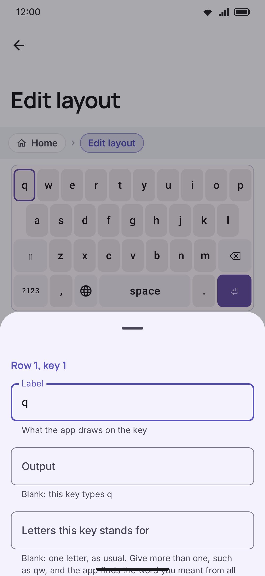
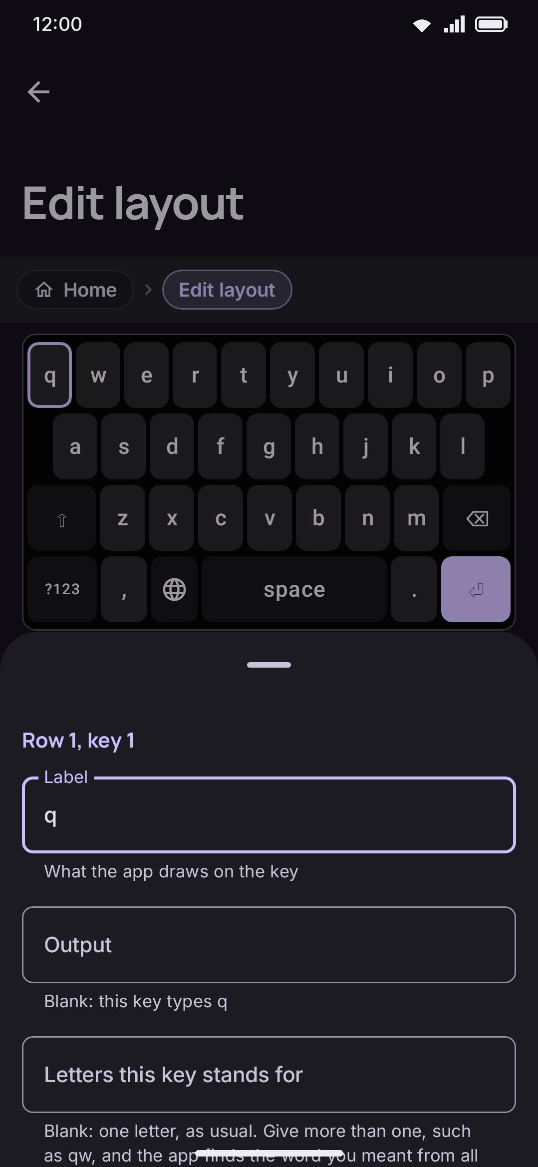
A layout has up to nine layers (Letters, Symbols, Symbols 2, Number, Phone, Date, Time, Date & time, and Fn), switchable with tabs across the top, followed by a tab for each of the panels. None of them has to be defined. Any layer you leave untouched falls back to the built-in grid for it, the shipped QWERTY’s, so a layout that only rearranges letters still gets a working number pad and symbol page without you drawing three hundred keys yourself. The Number layer is also what the Numpad tool, and a long press on ?123, put on screen, so a layout that authors one gets its own pad there too, in the order it drew it. The five keypads (Number, Phone, Date, Time and Date & time) keep their shared keys in the same places: the digits, ⌫ in the right column just above ⏎, and space at the top of that column on every pad that has one. Only the characters each field needs, like * and # on Phone or : on Time, sit in different slots, so a change to a shared key is the same edit on every pad. Letters gets one extra guarantee the others don’t, though. See Details & edge cases. A pencil icon on a tab marks a layer this layout has authored its own copy of. An unauthored tab shows the built-in grid live, with a note that editing it will fork a copy just for this layout.
A “Show the shift plane” toggle redraws every key with its shiftLabel (or an uppercased label) instead of the primary one, so you can check the shifted layer without switching layers.
Keys set to “switch layout”, “emoji panel” or “open a tool” draw an icon in the grid rather than the label stored on them. The globe key is the one you’ll meet: its stored label is the emoji 🌐, but the keyboard has always drawn its own monochrome globe icon there instead, and now the editor does too, so the grid matches what you actually type on. A tool key wears the tool’s own icon the same way, unless you give it a label, in which case the label wins. Change the key’s action and it goes back to drawing its label.
Editing a key
Section titled “Editing a key”Tap any key to open its edit sheet:
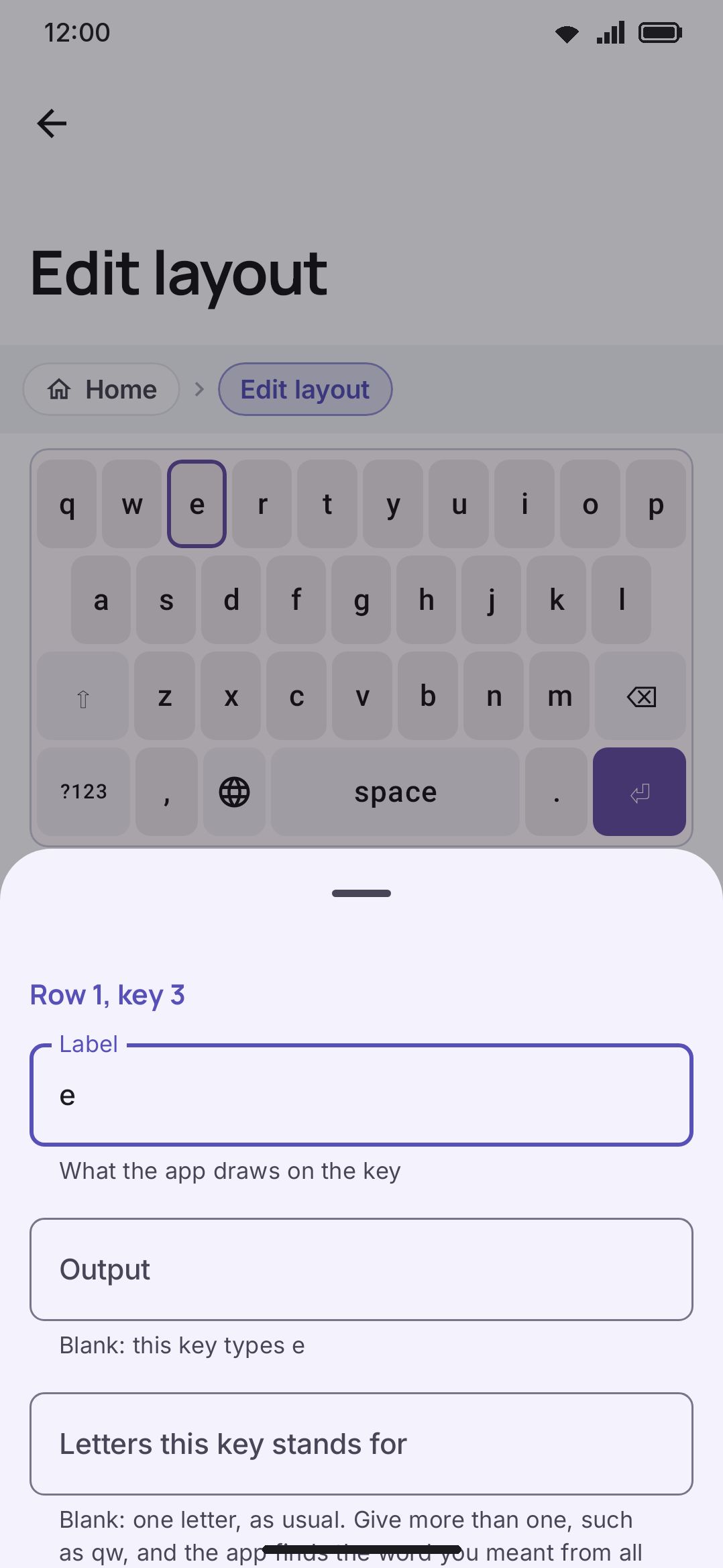
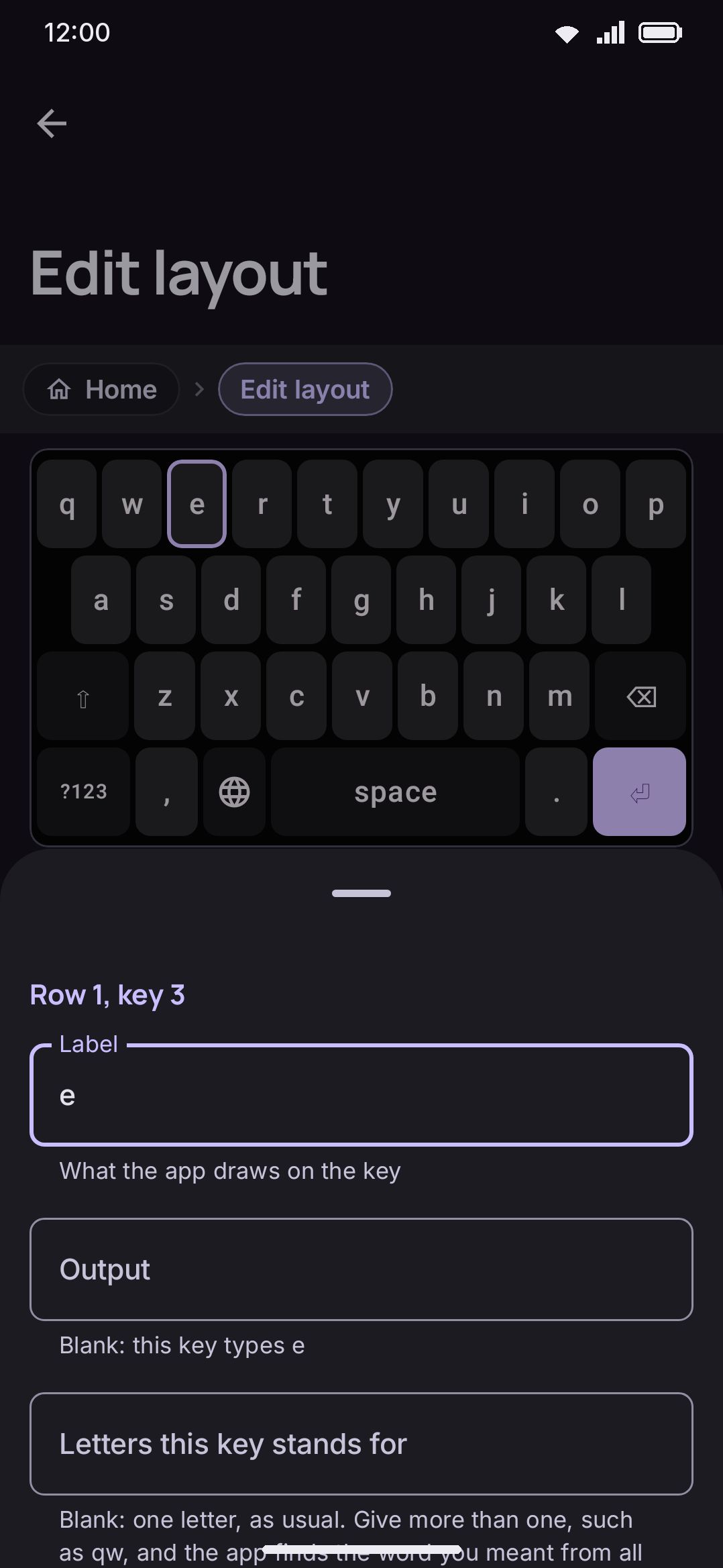
-
Label: what’s drawn on the key. On Shift and caps lock, a label replaces the arrow: write
A,ABCor a word and the key shows that instead, lit in the accent colour while shift is on. Leave it blank, or write⇧or⇪, and the key keeps the arrow your icon pack draws. Any other action key left blank draws its action’s icon, the same one the grid preview and the press and hold popup show. -
Output: what it actually types; leave it blank and it types the label.
-
Shift label: leave it blank and Shift uppercases the label.
-
Flick directions: what a short swipe from the key in one of eight directions types instead of the tap, the way the Japanese Flick pad reaches い, う, え and お from あ, and the way the shipped English flick (3×3) layout keeps all twenty-six letters on nine keys, MessagEase style, with
ocarrying q, u, p, c, b, g, d and j on its eight arms. See Flick keys for how the gesture reads. A key with no flicks shows an “Add flick directions” row; tap it, or open a key that already has some, and a 3×3 pad appears with the key’s own label in the middle and a cell for each of the eight arms, the way the key itself draws them. Tap a cell to edit that arm in the field under the pad; a cell with nothing in it shows a faint plus. Leave the field blank for no flick that way, and Remove all flick directions under the pad clears the lot. The grid preview draws each flick’s character at the edge or corner of the key it is flicked towards, so you can see the whole pad at a glance, and the keyboard draws them the same way unless Show flick arms on keys is off. A layer with flick keys has its own Show flick arms here switch below its rows, for showing or hiding them on that layer alone. Under each direction that types something is a with Shift field: what that flick types while Shift is on, the way the shift label works for the tap. Leave it blank and Shift makes the flick a capital letter, as it does for the label, and so does a swipe out to the arm and back again. A kana pad with a Shift key can so put katakana on its hiragana keys: あ with Shift types ア, and its left flick い types イ. The flick cross shows the shifted kana while Shift is on. A layout that uses the four corners needs this release or newer to open; an older build declines the whole file rather than guess.Any flick can also do an action instead of typing: tap the ⚡ button at the end of its field and pick one from the same list as the press and hold actions. A text editing action asks which operation next, so a key can move the cursor with its flicks. A flick that moves the cursor or deletes keeps going while you hold your finger on it, the same as the key for it. Action flicks work on action keys too, where they are the only kind: open a Select key, tap “Add flick directions”, and give its arms the four arrows. The flick cross, the key’s face and the grid preview show each action’s icon. Choosing an action for a direction removes that direction’s text. The space bar, the delete keys and a key set to repeat while held keep their own drags and holds, so they get no action flicks; a modifier, ?123 or 🌐 key given action flicks flicks instead of starting its drag.
Change a text key to an action afterwards and its text flicks go quiet: the key neither shows them in the flick cross nor types them, though the JSON keeps them in case you change it back. The fields are
flick,flickShiftandflickActionsin the JSON, keyed by direction:left,up,right,down,up_left,up_right,down_leftanddown_right. -
Becomes 小゛゜ after a kana, on the keys of a Japanese layout: a switch, off by default, that makes the key stand in for the 小゛゜ key while the last kana you typed (hiragana or katakana) has a small, ゛ or ゜ form. The key shows 小゛゜ and a tap changes that kana; when the word is done, or the kana has no other form (な, ん), it goes back to what it was. Turn it on for the globe or emoji key and you can delete the separate 小゛゜ key and give its space to something else, the way phone kana pads do it. The preview marks such a key with a small 小゛゜ in its corner. The field is
kanaVariantWhileComposingin the JSON. -
Action: opens a picker with 36 options across seven groups: typing (types text, Shift, caps lock, Delete, forward delete, Space, Enter, a new-line key that always types a line break even where Enter would send, and the Japanese 小゛゜ key, which changes the last kana you typed to its small, ゛ or ゜ form, and the two Korean keys of the 나랏글 pad, 획추가 and 쌍자음, which add a stroke to the last Korean letter you typed (ㄱ to ㅋ, ㅏ to ㅑ) or double it (ㄱ to ㄲ), and the T9 Pinyin pad’s syllable list, a scrolling column that lists the syllables your keys could spell while you type and the key’s long-press characters the rest of the time; give it a few rows’ height), layers (symbols page, letters page, emoji panel, switch layout, switch keyboard, switch to a specific keyboard for a key that hands the field to one named keyboard app with no picker in between, Fn layer, and “open a layout” for one of your secondary layouts), modifiers (Ctrl, Alt, Meta; tap to arm, double-tap to lock, or drag from it onto another key to fire the combination in one movement, the same as dragging from Shift), keys apps understand (Tab, Esc, arrow keys), a text editing action (the same twenty-one operations the text editing panel’s keys run: the four arrows, word left and right, page up and down, start and end of the line, start and end of the text, Select, Select all, Select word, Select line, Cut, Copy, Paste, Delete and Forward delete, picked on a second screen the moment you choose it; the arrows, the word and page moves and the two deletes repeat while held, the rest can hold to an alternate), chorded input (braille dot, morse dot, morse dash), and a catch-all group for an “Open a tool” key, a broadcast-intent key (fires an Android broadcast for automation apps like Tasker) and a “Nothing” key that deliberately swallows taps. The list is longer than the dialog, so it scrolls, and a rail down its right edge says so: one segment for each group, sized by how many actions the group holds, with the group you are reading lit. Drag the rail to move through the list quickly, and the group name follows your finger.
-
Tool, on an “Open a tool” key only: which of the keyboard’s tools the key opens, picked from a list of every tool this build has. The key wears the tool’s own icon, and pressing it does exactly what tapping that tool on the toolbar does. The tool doesn’t have to be on your toolbar for the key to work, so this is a way to keep voice typing or the editing pad one press away without spending a toolbar slot on it.
-
Layout, on an “Open a layout” key only: which of your secondary layouts the key shows, picked from a list of them by name. The layout’s name lands as the key’s label unless you already wrote one. Pressing the key shows that grid in place of the letters; pressing it again, or any ABC key, goes back.
-
Width: a slider, a minus / value / plus stepper, preset chips for 1 / 1.25 / 1.5 / 2 / 4, and a “Fill the row” button. The stepper is the one to reach for when a preset is close but not right: the buttons move by 0.05, and the field between them takes an exact value you type. Widths go to two decimals, so 1.43 (the width seven keys need to fill a ten-wide grid) is something you set here rather than in the JSON.
-
Covers N rows: chips that make the key taller, so it reaches down into the rows below it. Leave it at 1 (the default, and what every shipped layout uses) for an ordinary key. Set it to 2 and the key draws twice as tall, and the row under it lays its own keys out around the column the tall key is standing in, the way cells flow around a
rowspanin a table. That’s how arrangements like ClearFlow put a full-height Enter down the right-hand edge. The chips stop at the number of rows left below the key, so a key on the last row doesn’t offer the control at all. -
On every key except a panel component: Icon, a picker that draws the icon in place of the label. It lists the keyboard glyphs first (arrows, editing, keyboard chrome), then the app’s own icons, with each icon’s name under it and a search box. The name is what a hand-written layout stores in
icon. Names match case-insensitively, shorthand aliases likedeleteforbackspaceorglobeforlanguagealso work, and an unrecognized name falls back to drawing the label. Every icon the keyboard draws anywhere of its own accord is in the list, so any tool’s glyph can go on a key. The search box takes more than the stored name: an alias and the name of the tool that wears the icon both find it, so searching for “clipboard” lands on the paste glyph and “selection mode” onSelectAll. An icon on Shift, Enter, Delete or the globe key replaces the glyph the icon pack gives it. On the space bar the icon replaces the language name, and Keep the language name (iconBesideLabel) draws it before the name instead. -
On text keys only: Icon hint (the same picker, for the corner hint), and Field adaptation (none, comma slot, period slot, or exactly as laid out). An email field replaces the comma slot with
@and a web-address field replaces it with/, while the period slot keeps its character and gains domain endings like.comon its long-press. “None” means work it out from the key, which is what every layout written before this control existed relies on: a.or a,on the bottom row fills its slot whether or not it says so. Exactly as laid out is the way to say you meant it: the key fills no slot and nothing substitutes its character, which matters on a language that ends sentences with something other than a full stop. On Japanese, Bengali, Hindi and the rest, a bottom-row.on the letters page is otherwise drawn as that language’s own mark (。,।) with the full stop moved to its long-press. Every other layer (the symbols pages, an Fn or Number layer, a secondary grid) leaves the key alone and puts the mark on the long-press instead, so a decimal point is always one tap. -
Repeat while held: a switch that makes holding the key keep doing what it does, the way holding Delete does. It waits out the same Time before a key repeats every other repeat does and then runs at Repeating key interval, both under Key press. Arrow keys are the case it exists for: add a row of ← ↓ ↑ →, turn this on for each, and a hold walks the cursor instead of asking for one tap per character. It’s offered wherever a second press does something the first didn’t, so not on a layer switch, a modifier, a tool or the globe key, and not on the keys that already repeat by themselves. It costs the key its press and hold, so the alternates fields below vanish while it’s on; what you typed into them is kept and comes back when you turn it off. The field is
repeatOnHoldin the JSON. -
Alternates for press and hold (space-separated, so an alternate can’t itself contain a space; multi-character entries like
.comwork fine, and the first one doubles as the small corner hint) and Actions for press and hold, a chip each for the entries in that same popup that do something instead of typing. Tap “Add an action” and pick from the same list the Action row offers, minus “types text” and “Nothing”: Tab, a layer switch, a modifier, or “Open a tool” for voice typing, the editing pad, the clipboard and the rest. Tap a chip to change it, or the × to remove it. Both fields show on any key whose press and hold is free, which is every key except Delete, forward delete, Space and the braille dots, since those four hold to repeat or to chord. Enter is the one most people want: give it Tab, and a form is one keyboard away from filling itself in. Once a key has both, Where the actions go moves the actions from the end of the popup to the front or after any one of the alternates, so they can be one short slide from the key while a plain hold still types the first alternate. The field isactionAlternatesAtin the JSON. -
Action on press and hold: one action that holding the key runs straight away, with no popup, such as Cut on X or forward delete on .. A delete or a cursor move repeats while you hold. It takes the key’s press and hold, so the alternates fields go away while it’s set and come back when you remove it. Not on Space or a key with flicks. The field is
holdActionin the JSON. -
Columns in the popup, once the key actually has alternates: a minus / value / plus stepper that fixes how many of them go on a row for this key. It starts at “From settings”, which hands the key to the keyboard-wide Alternate key columns row under Key press, and steps on through 3 to 11. It’s per key because the right answer is: a
1carrying a dozen fractions wants a grid five or six wide, while anecarrying four accents wants the single row it already gets. A number set here wins over the setting; every other key on the layout keeps following it. The field isalternateColumnsin the JSON, where 0 means “from settings”. -
Label size: how big this one key’s caption is drawn, as a multiple of an ordinary letter. Automatic is the default and is what every shipped key uses: a letter is drawn large, and a multi-character mode label like
?123is drawn smaller. Setting a size replaces that decision, so ×1 is a real instruction and means “draw this word at full letter size”. Chips offer ×0.5, ×0.7, ×1 and ×1.3, and a slider covers ×0.3 to ×2. This is where a HeliBoard label flag lands when you import a layout. -
Corner hint: three ways this one key can answer the keyboard-wide “Long-press hints” setting under Appearance. “From settings” is the default and follows it. “Never” turns the little hint off on this key alone, and nothing else about the key changes: long-press still opens the alternates, they’re just not advertised in the corner any more. “Always” is the opposite, and the reason it exists: turn the hints off everywhere, then put them back on the two or three keys whose alternates nobody would guess. The row only shows up on a key that has a hint to draw (an icon hint, or character alternates on a key that opens the popup), so it doesn’t take up a row on the other forty keys. In a hand-written layout the two halves are the
hideHintandforceHintfields, andhideHintwins if a file sets both.
The sheet also has buttons to delete the key, duplicate it, or move it. Left and right still swap it with a row neighbor, and up and down move it into the row above or below. The grid preview itself is draggable too. Press and hold a key, then drag it to any row, and a caret marks where it will land. Two fields exist only in the raw JSON, because they’re rare enough that a dedicated control would crowd the sheet for everyone else. One is a clipboard action (select all / copy / paste / cut / undo / redo, fired on long-press instead of the alternates popup). The other is multitap, a list of what tapping the key again types, the way a phone keypad works: "output": "ㄱ", "multitap": ["ㅋ", "ㄲ"] types ㄱ, then ㅋ in its place on a second tap, then ㄲ, then ㄱ again. A tap only continues the cycle when it’s the same key within a second of the last one; a pause, or any other key, starts over. The Cheonjiin pad uses it for its consonants and its .,?! key.
Rows and layers
Section titled “Rows and layers”Select a key and a row action bar appears above the grid: add a key to that row, duplicate the row, or delete it (disabled once only one row is left). A red warning line shows if the row’s total width doesn’t match the layer’s overall grid weight, and a Fit the row to the grid button under it clears that in one press: it scales every key in the row by the same factor, so a row whose keys are deliberately several different sizes keeps those proportions and still lands exactly on the grid. That’s the one to use on a mixed-size row. “Fill the row” in the key sheet is the other answer, and it gives all the slack to the one key you have open.
A row height slider (×0.4–×2.5, with a stepper and 0.75/1/1.25/1.5/2 presets) adjusts just that row, and the preview draws each row at the height you set it to.
A row narrower than the grid is centred, with equal gaps at both ends. That’s how a nine-key home row sits under a ten-key top row. The one exception is a row with a space bar on it: the space bar stretches to take up the slack instead, so the bottom row always reaches both edges of the keyboard however wide the letters above it are. It’s the same rule the tablet widening uses. A row with no space bar, or with two, is centred as before.
Below the grid: “Add a row” appends an empty one, “Reorder rows” opens a drag-reorder dialog, “Reorder keys in row N” appears once a multi-key row is selected, and “Reset this layer” (shown only on an authored layer) drops your changes and falls back to the inherited grid.
Copying a layer
Section titled “Copying a layer”Two rows above “Reset this layer” move one layer at a time. Copy this layer puts the grid you’re looking at on the system clipboard, and Paste a layer replaces the grid you’re looking at with whatever layer is on the clipboard. That covers four jobs with one pair of buttons: duplicate the Date pad into the Time tab, carry a symbols page from one layout to another, hand someone a layout’s letters grid in a chat message, or keep a plain-text backup of a layer you’re about to rewrite.
The clipboard holds the same JSON the raw editor prints for that layer, wrapped in a small header naming the format and which layer it came from. That header is why pasting a shopping list is rejected rather than half-read, and why the confirmation can tell you what landed where. Copying works on an inherited layer too, which is the common case for sharing, since most layouts change the letters, or the letters and the symbols, and nothing else.
A pasted layer goes through the same repair pass an imported layout gets, judged against the layer it lands in rather than the one it came from, so a key naming an action this build doesn’t have is dropped and reported instead of breaking the grid. What it doesn’t do is add keys. Paste a grid with no space bar into Letters and it stays exactly as you pasted it, with the missing keys named in the Problems list. Paste is one undo step, so a paste onto the wrong tab is one press to take back.
Undo and redo hold up to 30 whole-layout snapshots for the session (not saved between visits), and everything you type inside one key’s edit sheet coalesces into a single undo step, so relabeling a key isn’t twenty tiny undos. There’s no save button: every change writes through immediately, and the screen says so (“The app saves every change”).
A “Problems” section at the bottom lists live validation findings as you edit. See Details & edge cases for what gets checked.
The bottom row and its settings
Section titled “The bottom row and its settings”The Bottom row keys settings change the bottom row of every layout as the keyboard draws it: Emoji key instead of 🌐, Swap the comma and 🌐 keys and Keep the 🌐 key in one place are all on by default, and Show the 🌐 key and Comma key opens emoji can change it too. The editor draws the row the same way the keyboard does, so with the default settings a shipped layout stored as ?123 · , · 🌐 · space shows ?123 · emoji · , · space in the editor as well. Under the grid, a note names the settings that change this layer’s row, with a link to them.
Moving or changing a key those settings moved or changed (the emoji key, the comma beside it, a spacebar they resized) turns on Keep this bottom row as it is here for that layer. The layer then keeps the row exactly as the grid showed it, your change included, and the settings leave it alone from then on, so a key you place stays where you put it. You can also turn the switch on yourself before editing. Turn it off and the settings arrange the row again. Keys the settings don’t touch, like the full stop or Enter, edit in place without turning anything on.
The switch is per layer. The symbols page a layout still inherits keeps following the settings, and since the letters were written down as the settings drew them, the two rows still match on the way into ?123. In the raw JSON it is "bottomRowAsLaidOut": true on the layer.
Keeping a layer open
Section titled “Keeping a layer open”Normally the keyboard goes back to the letters every time it opens: minimise it, switch apps, tap into another field, and whatever layer you were on is gone. Keep this layer open is a switch on every layer except the letters of an ordinary layout (and on the one grid of a secondary layout), and it changes that rule for that layer alone. The same switch sits in each panel layout’s editor, so the text editing pad, the emoji panel, the clipboard or the trackpad can stay open across fields the same way. With it on, the layer stays until you press a key or a tool that takes you somewhere else. Closing the keyboard is not that, and neither is a new field, an app switch, or the keyboard being shut down and started again in the background between one field and the next.
It’s a per-layer switch on purpose. One symbols page you actually live on can stay put while the same layout’s Fn layer still springs back, with no list of “persist if…” conditions to maintain. The catch is in the switch’s own subtitle: the keyboard can no longer take you off the layer by itself, so it needs an ABC key, a symbols key, or the Secondary layout tool on the toolbar. The Problems list repeats the reminder for as long as the switch is on, as a warning that stops nothing.
Label font and size
Section titled “Label font and size”Two rows below the grid set the type for the whole layout, not one layer and not one key.
Label font picks the face this layout’s captions are drawn in. It offers the same three sources the theme font does: follow whatever is already set, a Google Fonts family, or a font from your installed library. On a layout whose language uses a script with its own font list (Bengali, Devanagari, Arabic and the rest), the picker narrows to faces that carry that script.
The layout’s font wins over the theme’s, and loses to a font you picked for that script yourself under Fonts. For a Latin, Cyrillic or Greek layout that means the English font: set it to anything other than System default and it wins over this layout’s font. The order runs: your own font for the script, then this layout’s, then the theme’s, then the automatic face for the script. Naming a font that isn’t installed on a device costs nothing: it falls through to the next answer instead of leaving the keys blank, which is what lets a layout file carry a font across devices.
Label size is a multiplier, not a size. Automatic is the default. Set ×0.8 and every label on this layout is drawn a fifth smaller than it would otherwise be, whatever that turns out to be: your Appearance font size, your accessibility font size and any size the theme sets are all still in effect underneath it. That is the point. A layout that replaced the number would quietly throw away larger type you set on purpose. The range is ×0.5 to ×2.
Label size on this layer is the same control for one layer, and it sits above the layout-wide one. It replaces the layout size rather than stacking on it, which is what keeps the two independent: grow the letters to ×1.4 and the symbol page stays exactly where it was, as long as you give the symbol page a size of its own. Leave it on Automatic (the default on every layer) and the layer follows the layout. Setting it on a layer you haven’t edited yet forks that layer’s grid into this layout, the same as any other edit to an inherited layer.
All three are stored in the layout, so they export with it and they apply only while that layout is the one you’re typing on. Switching language switches them back.
A theme of its own
Section titled “A theme of its own”A layout can name a theme, and so can each of its layers. The Theme row sits under the layout’s name, and a Theme for the … layer row sits with the other layer-scoped controls under the grid. Both open the same picker the keyboard modes use, with every built-in theme and every theme you’ve made, so a custom theme is as pickable as a shipped one. Inherit is the default on both and means what it says: the layout takes whatever theme is set, and the layer takes the layout’s.
While a layout with a theme is on screen, the keyboard draws in it. It replaces the theme you set elsewhere and it replaces an automatic light-and-dark pair for as long as the layout shows, and your own selection doesn’t change: switch to another language and its theme comes back. A layer’s theme beats the layout’s, so a symbols page can wear its own colours over a layout that has some of its own. The panels have the same row, Theme for this panel, on their tabs and in the shared panel editors: while that panel is open the keyboard draws in its theme, and a panel with none inherits the layout’s. The preview in the editor draws in the theme the grid you’re editing asks for. A theme you’ve since deleted is ignored rather than removed from the layout, so a layout exported with its theme still remembers the pairing.
Tablet keys
Section titled “Tablet keys”Add tablet keys automatically is a switch for the whole layout, not one layer. On a tablet the keyboard widens every ordinary alphabetic grid by a column each side and fills the space with Tab, backslash, caps lock, a second shift and the rest, described in full under size & position. It’s on for every layout, including yours.
Turn it off for a layout you’ve already laid out wide by hand, or one you want kept exactly as authored. If the switch says the setting has no effect, the widening already declines this layout on its own (it does that for flick pads, braille, morse, any grid with no shift key, and any grid with a key that covers more than one row), and the switch is only there to record your answer in case the layout changes later.
Your phone grid is what the editor shows and what you’re editing. The tablet keys are added on top of it at typing time, so there’s no second grid to keep in step.
Reaching the raw JSON
Section titled “Reaching the raw JSON”“Edit as JSON” at the bottom of the grid editor opens the layout as text, for anything the grid editor has no control for: clipboard actions, or pasting in a grid you built elsewhere.
The layout’s name, its language and its typing method used to live here too. All three are rows in the grid editor now, so a duplicate can be renamed and re-languaged without touching the JSON. To type one language on another language’s layout, QWERTZ for English say, there’s a shorter way: Use a layout from another language on that language’s screen under Languages does the copy and the language change in one pick. The language picker is the same searchable registry dialog the foreign-layout import uses, and the language is what picks the dictionary, autocorrect, script rules, dictation and shift behaviour for the grid. Typing method defaults to follow the language, which is right for almost every layout. Override it only when one language has both a phonetic and a direct grid.
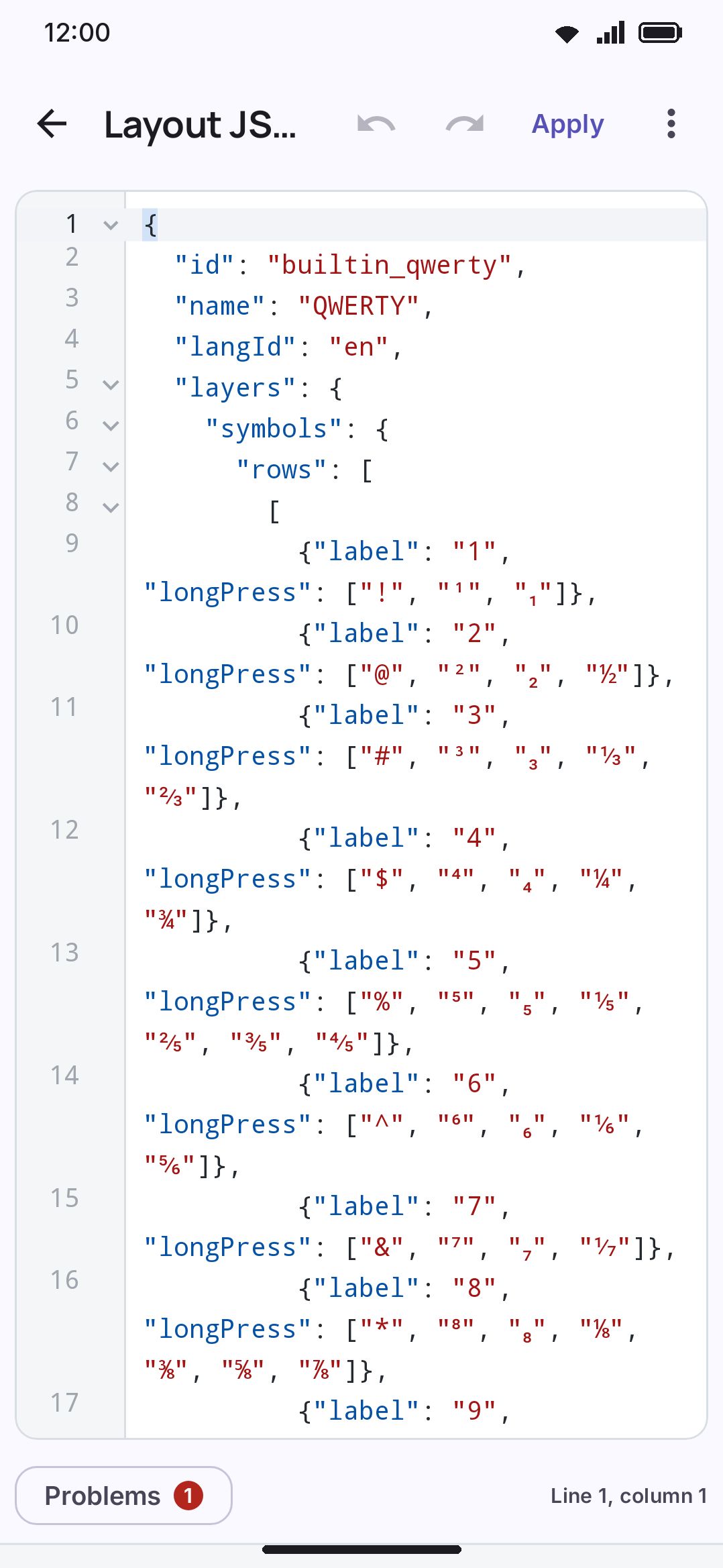
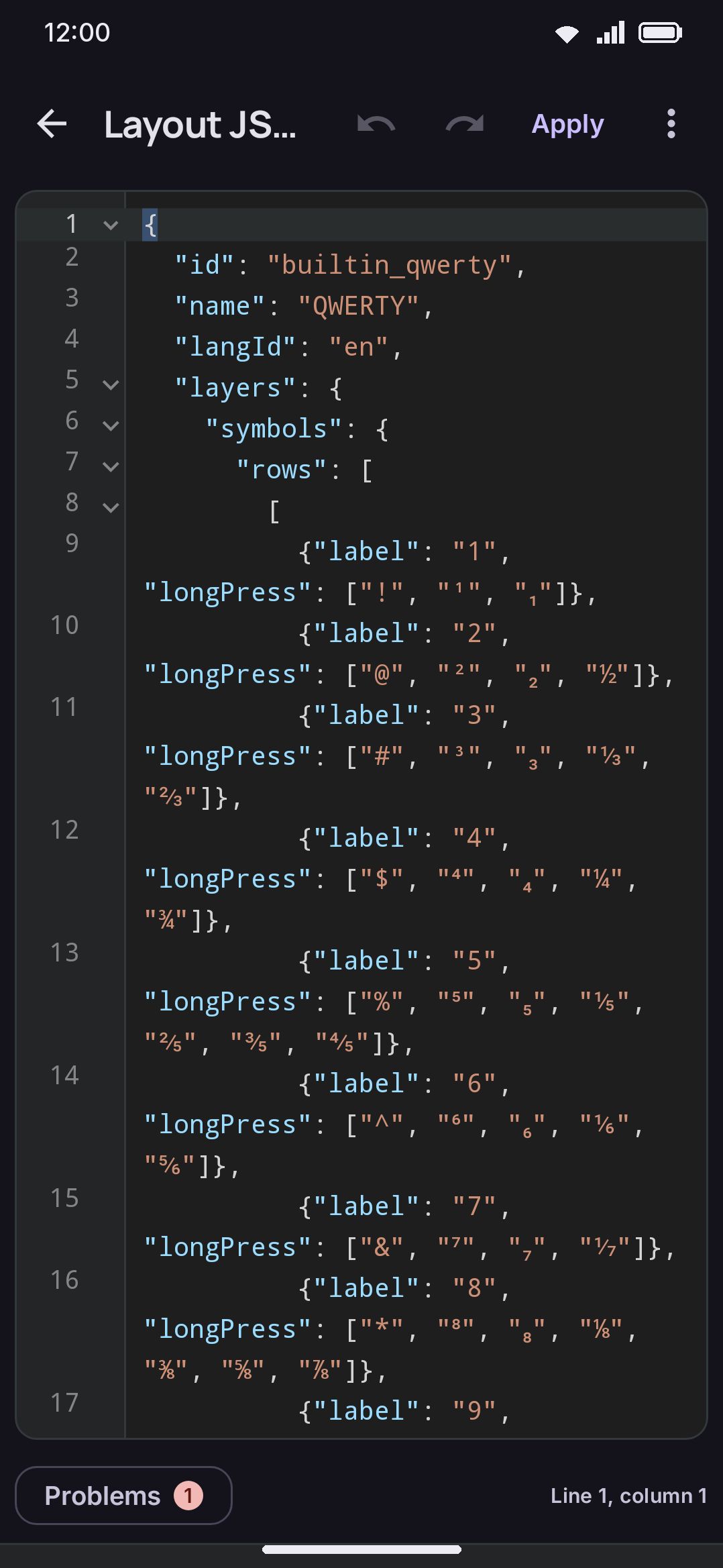
This screen works differently from the grid editor. It’s a draft with an explicit Apply button rather than autosave, because half-typed JSON isn’t a valid layout and there’s nothing sensible to save as you type. The text starts as your layout, JSON-encoded. Applying it parses the text, and invalid JSON shows “That is not valid layout JSON.”, jumps to the first error, opens Problems and stops there. A valid parse always keeps the id you were already editing, so pasting a different layout’s id in is deliberately ignored and you can’t overwrite a different layout by accident. It then runs the result through the same repair pass used on import (see below) and shows what got fixed. If nothing needed fixing, the screen closes for you. If something did, a dialog lists the changes, and the screen closes once you have read them. Back leaves without saving.
“Edit as JSON” opens a full-screen code editor, the same one the plugin editor uses, and it knows the layout format. It’s monospaced, on a code background, with the standard editor colors, numbered lines, the cursor’s line lit and bracket pairs boxed. Long lines scroll sideways rather than wrapping, which keeps one number against one line; Wrap in the menu turns that off. Undo, redo and Apply sit in the top bar.
It suggests as you type, from the format itself. Type " inside a key and the list shows the key’s properties, the required label first, each with its type and default. Choosing one writes the property, its colon and a blank of the right kind ("", [], {}, or true for a switch that is off by default) with the cursor in the blank, and when that blank has values of its own the list opens again. Pick action, then tool, then a tool, and you have written a tool key without typing a word. The values come from your device: tools, editing operations and panel components by their names in your language, icon names, your themes and fonts, your secondary layouts, and every language, found by its name as well as its id. In a row, a word like shift offers a whole shift key, and inside layers the list offers each layer you have not written yet, with a row ready to fill. Matching forgives shorthand, so lp finds longPress. Suggest on the code keys, Ctrl+Space or Ctrl+I opens the list anywhere.
It checks as you type, too. A problem gets a squiggle and a colored line number, and Problems under the code lists them all; tap one to jump there. The checks follow what Apply does. An error is something Apply can’t read, like a missing label, a number in quote marks, or an op this version does not have. A warning is something Apply survives by ignoring or changing it, like a misspelt property (named with the one it’s close to), an action type it does not know, or a width past what the keyboard allows. Once the text parses, the grid editor’s own checks run as well, so a letters layer with no delete key is flagged here the same as it is there.
A strip under the code explains whatever the cursor is on: the property, with its type, its default and a sentence about what it does, or for an action’s type, the action and the fields it takes. Tap the strip for the whole paragraph.
On a soft keyboard, a row of code keys sits on top of it: ", :, ,, both kinds of bracket, true, false and null, a second page of commands (duplicate or move a line, select, jump to a block’s start or end, find, format), and two cursor keys you can slide like a trackpad. Arrange the row from Code keys in the menu. The menu also has Find (with replace, regular expressions, and case and whole-word matching), Go to line, Fold all and Unfold all (every object and list folds from a chevron in the margin), text size, Copy and Paste.
Format re-indents the whole document with two spaces per level, and keeps an object or a list on one line while that line stays under 100 characters. A three-item list of long-press alternates stays a three-item list rather than becoming five lines, and a key is one line rather than six. The screen already opens that way, so Format is only for text you’ve pasted or hand-edited. QWERTY reads as 252 lines here where one field per line made it 1,142. On a hardware keyboard, the editor takes the keys Visual Studio Code uses, listed below.
Typing gets a few editor habits too. A newline keeps the indentation of the line above and goes one step deeper after { or [. Typing {, [ or " brings its closing half, typing a closing half where one already sits steps over it instead of doubling it, and backspacing over an empty pair takes both halves. None of this rewrites your text: what you typed stays exactly where you typed it until you press Format or Apply.
Keyboard shortcuts
Section titled “Keyboard shortcuts”With a physical keyboard, this editor and the plugin editor take the keys that Visual Studio Code uses on Windows and Linux, and ⌘ works as Ctrl. While the keyboard is attached, the menu shows the keys of each command beside it, and the row of code keys steps aside.
| Keys | What they do |
|---|---|
Ctrl+F, Ctrl+H | Find, or find and replace. A selection on one line becomes the search. |
Enter, Shift+Enter, F3, Shift+F3 | The next or the previous result. In the replace field, Enter replaces the result that shows and Ctrl+Alt+Enter replaces them all. |
Alt+C, Alt+W, Alt+R | In the find bar: match case, whole words, regular expression. |
Esc | Closes the suggestion list or the find bar. In the code, Esc does not leave the editor. |
Ctrl+G | Go to line. |
Ctrl+Space, Ctrl+I | Suggest at the cursor. |
Tab, Shift+Tab | Indent at the cursor, or move whole selected lines in. Shift+Tab moves them back out. |
Ctrl+], Ctrl+[ | Move the lines at the cursor in or out. |
Alt+Up, Alt+Down | Move the lines up or down. |
Shift+Alt+Up, Shift+Alt+Down | Copy the lines up or down. |
Ctrl+Shift+K | Delete the lines. |
Ctrl+Enter, Ctrl+Shift+Enter | A new line below or above, with the same indent. |
Ctrl+X, Ctrl+C, Ctrl+V | With nothing selected, cut or copy the whole line, and paste it back in above the line of the cursor. |
Ctrl+L | Select the line. Each press adds the next line. |
Shift+Alt+Right, Shift+Alt+Left | Grow the selection to the word, the line, the block and the document, and shrink it back. |
Home | The first character of the line that is not a space, then the start of the line. |
Ctrl+Home, Ctrl+End, Page Up, Page Down | The start, the end, one screen up or one screen down. Add Shift to select. |
Ctrl+Up, Ctrl+Down | Scroll one line, and leave the cursor where it is. |
Ctrl+Shift+\ | Go to the matching bracket. |
Ctrl+Shift+[, Ctrl+Shift+] | Fold or unfold the block at the cursor. |
Ctrl+K Ctrl+0, Ctrl+K Ctrl+J | Fold every block, unfold every block. |
Ctrl+Z, Ctrl+Y, Ctrl+Shift+Z | Undo, redo. |
Shift+Alt+F | Format. |
Alt+Z | Wrap long lines, or stop wrapping them. |
Ctrl+=, Ctrl+-, Ctrl+0 | Larger text, smaller text, the usual size. |
F8, Shift+F8 | The next or the previous problem. |
Ctrl+Shift+M | Show or hide Problems. |
F1, Ctrl+Shift+P | Open the menu. |
Ctrl+S | Here, Apply. In the plugin editor, save the draft now. |
Ctrl+/, Shift+Alt+A | Plugin editor: a line comment, a block comment. JSON has no comments. |
F5, Shift+F5 | Plugin editor: run or stop the plugin. |
F12, F2 | Plugin editor: go to the definition, rename. |
Ctrl+Shift+O, Ctrl+Shift+Y | Plugin editor: Outline, Console. |
The keys that the text field knows already keep working: Ctrl+A, the arrow keys with Ctrl and Shift, and Ctrl+Backspace to delete a word. The editor has one cursor, so the VS Code keys for more cursors, such as Ctrl+D, do nothing here.
When WM Keyboard is your keyboard, it takes Ctrl+Space to change the language before the editor gets the key (see Switching language). Use Ctrl+I for suggestions, or turn that setting off.
Every property and value
Section titled “Every property and value”Each section below opens to the full list for one part of the format: every property an object takes, with its type, its default and what it does, every action type with its fields, and every value a fixed list allows. The lists are read from the app’s own code when these pages are built, so they match the version they describe. The editor’s suggestions offer the same values as you type.
The layout object 14 properties
The top of the document.
| Property | Type | Default | What it does |
|---|---|---|---|
idrequired | string | The layout's identity. Apply keeps the id of the layout you are editing, whatever is written here, so a pasted id cannot overwrite another layout. | |
namerequired | string | The name the layout has in the list and in the language switcher. | |
langId | string a language id | "" | The language this grid types, such as "en" or "bn". It picks the dictionary, autocorrect, the script rules, voice typing and how Shift behaves. |
composer | ComposerType | null | How keystrokes compose, in place of the language's default. Leave it out unless one language has two methods, like Avro and Probhat for Bangla. |
layers | map of name → LayerSpec | {} | The grids this layout draws, by layer name. A layer you leave out uses the built-in grid, so a layout that only changes the letters still has symbols and numbers. |
proximityRows | list of string | null | One string of characters per physical row, for typo correction on a staggered or split grid. Leave it out and the rows come from the letters layer. |
tabletExpand | boolean | true | Whether a big screen may widen this grid with Tab, caps lock, arrows and the rest. Turn it off for a grid you already laid out wide by hand. |
keyman | KeymanBinding | null | The Keyman keyboard whose rules decide what the keys type. Only a converted Keyman layout has one. |
inputMethod | InputMethodBinding | null | The imported input method (a .cin table, a Rime schema or an m17n file) whose files decide what the keys type. Only a layout made by importing one has it. |
appearance | LayoutAppearance | null | This layout's own label font and size, over the theme and the settings. |
script | ScriptId | null | The script the keys write, when it is not the language's, such as PIQAD for Klingon pIqaD. It decides the font the keys use. |
secondary | boolean | false | A grid that a key or the Secondary layout tool opens, not a language: a symbols page of your own, or a macro pad. Only its letters layer is used. |
handwriting | boolean | false | A writing area in place of the letter keys, recognised in this layout's language. The letters layer is then only the bottom row under it. |
themeId | string a theme id | null | A theme of this layout's own, used while the layout is on screen. A layer's themeId beats it. |
A layer 9 properties
Each value under "layers".
| Property | Type | Default | What it does |
|---|---|---|---|
rowsrequired | list of list of Key | The rows of keys, top to bottom. Each row is a list of keys, left to right. | |
numberRow | list of Key | null | The number row above this grid, when that setting is on. Leave it out for the digits the layer always shows. |
fillRow | list of Key | null | On the symbols layer, the row shown in place of the digit row while the number row is on. Leave it out for = \ < > [ ] { } | ~. |
rowHeights | list of number | null | A height for each row, in the order of rows. 1 is the standard height, and a row with no entry is 1. From 0.4 to 2.5. |
fontScale | number | null | This layer's own label size, in place of the layout's. Useful for a symbols page that stays small while the letters grow. From 0.5 to 2. |
persistent | boolean | false | Keeps this layer on screen when the keyboard closes and opens again, instead of going back to the letters. |
bottomRowAsLaidOut | boolean | false | Draws the bottom row exactly as it is here. The Bottom row settings do not hide, move, swap or change its keys. |
themeId | string a theme id | null | A theme for while this layer is on screen, over the layout's theme and the settings. |
flickHints | boolean | null | Whether this layer's flick keys draw their arms on the key face. Leave it out to follow the keyboard's setting. |
A key 26 properties
Each entry of a row. Only label is required.
| Property | Type | Default | What it does |
|---|---|---|---|
labelrequired | string | What the key shows, and what it types unless output says something else. | |
output | string | null | What the key types, when that is not the label. |
shiftLabel | string | null | What the key shows and types while Shift is on. Leave it out and Shift makes the label a capital letter. |
action | action | {"type": "text"} | What a tap does. Leave it out for a key that types its text. |
width | number | 1 | How wide the key is, in standard keys. A space bar is often 4 and Shift 1.5. From 0.1 to 12. |
rowSpan | integer | 1 | How many rows the key covers, its own included. 2 makes a tall key, and the row below fits around it. From 1 to 8. |
longPress | list of string | [] | The characters a press and hold offers, in order. The first one is also the small hint in the corner of the key. |
actionAlternates | list of KeyAlternate | [] | Press and hold entries that run an action instead of typing, such as Tab or a tool. They come after the longPress characters. |
alternateColumns | integer | 0 | How many columns this key's hold popup uses. 0 follows the setting. From 0 to 11. |
clipboardAction | ClipboardKeyAction | null | A clipboard shortcut that a press and hold runs instead of opening the popup. |
role | KeyRole | null | Which punctuation slot this key fills, so an email or web address field can change it to @ or /. |
icon | string an icon name | null | The name of an icon to draw in place of the label. The label still names the key for a screen reader. |
iconHint | string an icon name | null | The name of an icon to draw as the corner hint, in place of the first alternate. |
hideHint | boolean | false | Draws no corner hint on this key, even when it has alternates. |
forceHint | boolean | false | Draws this key's corner hint even when hints are off in the settings. hideHint wins when both are on. |
flick | map of FlickDirection → string | {} | What a short swipe in each of the eight directions (left, up, right, down, up_left, up_right, down_left, down_right) types instead of the tap, for a kana pad or a MessagEase-style board. |
flickShift | map of FlickDirection → string | {} | What a flick in each direction types while Shift is on. Leave a direction out and Shift makes its flick a capital letter. |
flickActions | map of FlickDirection → KeyAlternate | {} | Flicks that run an action instead of typing, by direction, such as moving the cursor. They win over flick text in the same direction, and work on action keys too. |
labelScale | number | null | This key's label size, as a multiple of a letter's. Leave it out and the keyboard decides. From 0.3 to 2. |
letters | string | null | Every letter this key stands for, such as "abc" on a T9 key. The prediction works out which one you meant. |
iconBesideLabel | boolean | false | On the space bar, draws the icon before the language name instead of in its place. |
repeatOnHold | boolean | false | Holding the key does its action over and over, the way holding delete does. It spends the press and hold, so the key's alternates stop opening. |
kanaVariantWhileComposing | boolean | false | While the kana you are typing has a small, ゛ or ゜ form, the key shows 小゛゜ and a tap changes that kana. The rest of the time the key does its own action. |
multitap | list of string | [] | What tapping the key again types in place of the last tap, in order. After the last entry the cycle goes back to the key itself. |
actionAlternatesAt | integer | null | Where the actionAlternates go among the longPress characters: 0 puts them first, 1 after the first character, and so on. Leave it out to put them after all the characters. |
holdAction | KeyAlternate | null | An action that a press and hold runs at once, with no popup. A delete or a cursor move repeats while you hold. It spends the press and hold, so the key's alternates stop opening. |
Layer names 17
The keys of "layers". A layer left out uses the built-in grid. Any other name is a page of the layout's own, reached by a "layer" action key.
letterssymbolssymbols2numberphonedatetimedatetimefnpanel_emojipanel_gifpanel_stickerpanel_clipboardpanel_text_editpanel_trackpadpanel_numpadpanel_handwriting
The panel_… layers are this layout's own grid for a tool panel, in place of the shared one. They take the panel components listed under Panels.
Action types 33
The "type" of a key's "action". Which action the key runs. The other fields of this object depend on it. A key with no action types its output or label.
| type | Fields | What it does |
|---|---|---|
text | Types the key's output, or its label. It is the default, so it is usually left out. | |
shift | Shift. One tap gives one capital letter, a double tap gives caps lock. | |
caps_lock | Turns caps lock on or off in one tap, with no one-letter step. | |
delete | Deletes the character before the caret. It repeats while held, and a swipe deletes words. | |
forward_delete | Deletes the character after the caret. It repeats while held. | |
space | Types a space. Holding it opens the language picker, unless the key has alternates. | |
enter | Enter, or the field's own action, such as Send or Search. | |
newline | Types a line break, and never the field's Send or Search action. | |
editor_action | Fires the field's own action, Send or Search or Go, whatever Shift is doing. The enter key's hold uses it while a shift has turned the key itself into a line break. | |
symbols | Goes from the letters to the symbols, and between the two symbol pages. | |
letters | Goes straight back to the letters. | |
language_switch | Goes to the next layout that is on. | |
input_method_picker | Opens the system list of keyboards, to change to another keyboard app. | |
switch_input_method | id string= "" | Hands the field straight to one keyboard app you name, with no list in between. A keyboard that is no longer on opens the system list instead, so the key is never dead.id: The other keyboard's input method id, the package/.ServiceClass text the system files it under. Leave it blank and the key opens the system list. |
emoji | Opens the emoji panel. | |
tool | Opens one of the keyboard's tools, the same as its toolbar button.tool: Which tool the key opens. | |
layout | Shows one of your secondary layouts in place of the letters. A second press goes back.id: The id of the secondary layout. | |
layer | Shows another of this layout's own grids: the page key of a layout spread over several pages. Naming the letters layer, or a layer this layout does not have, goes back to the letters.layer: The layer's name, as it is spelled under "layers". | |
mod | Ctrl, Alt or Meta for the next key. Tap to arm it, and tap again to lock it.key: Which modifier. | |
send_key | Sends a key press to the app, such as Tab, Escape or an arrow.keyCode: The Android key code, such as 61 for Tab or 111 for Escape.meta: The modifiers held with the key, as Android meta flags. 4096 is Ctrl, 2 is Alt and 1 is Shift. | |
fn | Shows the Fn layer for one key, then goes back. A quick second tap keeps it. | |
kana_variant | Changes the last kana to its dakuten, handakuten and small forms, one after another. | |
add_stroke | Adds a stroke to the last Korean letter typed: ㄱ to ㅋ, ㄴ to ㄷ to ㅌ, ㅏ to ㅑ, and back. | |
double_consonant | Changes the last Korean consonant typed to its double form and back: ㄱ to ㄲ, ㅂ to ㅃ. | |
reading_column | A scrolling list in place of the key. While a T9 pinyin reading is typed it lists the syllables the next keys could spell, to pick one. Otherwise it lists the key's longPress entries, to type one. | |
broadcast | action stringrequired | Sends an Android broadcast, for an automation app like Tasker. It types nothing.action: The intent action of the broadcast. An app must listen for this exact text. |
braille_dot | dot integerrequired | One dot key of the six-key braille layout. It fires when pressed, and the cell types when the last dot lifts.dot: The braille dot number, from 1 to 6. From 1 to 6. |
morse_dot | The dot key of the morse layout. | |
morse_dash | The dash key of the morse layout. | |
keyman_key | vkey integerrequiredmodifiers integer= 0nextLayer string= nullid string= nulltext string= nulllongPress list of KeymanTarget= []flick map of FlickDirection → KeymanTarget= {}multitap list of KeymanTarget= [] | A key of a converted Keyman layout. The Keyman rules decide what it types.vkey: The Keyman virtual key.modifiers: The Keyman modifier mask that the rules match as held.nextLayer: The layer to show after the key, unless a rule picks one.id: A T_ or U_ key's own name, looked up in the Keyman keyboard's key list.text: What a long-press or flick key types when no rules are loaded.longPress: The Keyman keys behind the key's long-press entries, in the same order.flick: The Keyman keys behind the key's flicks, by direction.multitap: The Keyman keys that later taps of the key press, in the same order as the key's multitap list. |
none | A gap in the grid. It draws as empty space and does nothing. | |
field | kind PanelFieldKind | A panel cell that holds a live component, such as the emoji grid. Only a panel layout can hold one.kind: Which component the cell holds. |
edit | One text editing operation: an arrow, a selection, copy or paste.op: Which operation. |
A popup or flick entry 3 properties
Each entry of actionAlternates, each value of flickActions, and holdAction.
| Property | Type | Default | What it does |
|---|---|---|---|
actionrequired | action | What choosing this entry does. | |
label | string | "" | What the popup draws for this entry. Blank draws the action's own glyph or icon. |
icon | string an icon name | null | The name of an icon to draw in place of the label. |
appearance, keyman and inputMethod 6 properties
The small objects a layout can carry.
| Property | Type | Default | What it does |
|---|---|---|---|
fontId | string a font id | null | The label font: "default", "google:<Name>", "installed:<name>" or "custom". A font this device does not have falls back to the usual one. |
fontScale | number | null | Multiplies the label size the settings chose. 0.8 draws the labels a fifth smaller. From 0.5 to 2. |
keyboardIdrequired | string | The id of the Keyman keyboard. | |
version | string | "" | The version of the Keyman keyboard the layout came from. |
idrequired | string | The folder the imported input method's files are kept in. | |
kind | InputMethodKind | "TABLE" | How the method types: table offers the entries a code starts, reading converts syllables like pinyin, rules writes the text in place. |
Tools 84
The "tool" of a {"type": "tool"} action. A tool this build does not have, such as a scanner on the lite build, makes the key do nothing.
EMOJICLIPBOARDSNIPPETSTEXT_EDITTRACKPADONE_HANDEDSPLITFLOATINGSETTINGSFLASHLIGHTCOMPASSLEVELUNDOREDOMOON_PHASEWEATHERCALENDARINCOGNITOTHEMESAUTOCORRECTSOUND_HAPTICSNUMPADHANDWRITINGCAMERADICTIONARYVOCABULARYTRANSLATEGIFSTICKERWEB_SEARCHIMAGE_SEARCHOCRQR_SCANDOC_SCANVOICEGRAMMARWIKIPEDIASYMBOLSCALCULATORUNIT_CONVERTCURRENCYQR_GENPASSWORD_GENAIMODESTYPING_TESTMEDIA_CONTROLPLUGINSPOWER_SAVINGAPP_LAUNCHERFANCYCUSTOM_LAYOUTRESIZECURSOR_LEFTCURSOR_RIGHTCURSOR_UPCURSOR_DOWNCURSOR_HOMECURSOR_ENDPAGE_UPPAGE_DOWNCURSOR_WORD_LEFTCURSOR_WORD_RIGHTSELECT_WORDSELECT_LINESELECT_ALLSELECT_MODECOPYCUTPASTEHIDE_KEYBOARDPERSISTENTSELECTION_ACTIONSLEARN_FROM_TEXTPHONETIC_ENGLISHKDE_CONNECTSTATISTICSFIND_REPLACENOTESAI_REPLYLOCATIONCLOCKGALLERYLANGUAGE
Editing operations 21
The "op" of a {"type": "edit"} action. It is required: an operation this version does not have is an error, not a fallback.
UPDOWNLEFTRIGHTHOMEENDPAGE_UPPAGE_DOWNWORD_LEFTWORD_RIGHTSELECT_WORDSELECT_LINESELECTSELECT_ALLCOPYPASTEBACKSPACEFORWARD_DELETEDOC_STARTDOC_ENDCUT
Panels and panel components 8 panels
A panel layout's "panel", and the "kind" of a {"type": "field"} cell that holds one of its live components. Each component goes on its own panel, at most once.
| panel | Components it takes |
|---|---|
emoji | emoji_tabsemoji_searchemoji_gridmedia_tabs |
gif | gif_browser |
sticker | sticker_browser |
clipboard | clipboard_searchclipboard_entitiesclipboard_listclipboard_view |
text_edit | Keys only. |
trackpad | trackpad |
numpad | Keys only. |
handwritingfull build only | handwriting_canvas |
media_tabs, the emoji, GIF and sticker switch, also goes on the gif and sticker panels.
Other value lists
clipboardAction Key.clipboardAction
SELECT_ALLCOPYPASTECUTUNDOREDO
role Key.role
PeriodCommaPlain
Flick directions the keys of flick, flickShift and flickActions
leftuprightdownup_leftup_rightdown_leftdown_right
mod key the key of a "mod" action
CTRLALTMETA
inputMethod.kind InputMethodBinding.kind
tablereadingrules
A role of Period or Comma marks the key an email or web address field turns into .com, @ or /. Plain says the key types exactly its label, wherever it sits.
Composers 19
The "composer" of a layout. Leave it out to use the language's own; set it only when one language has two typing methods.
NONE | |
DEAD_KEY | |
TRANSLITERATE | |
INDIC_CLUSTER | |
HANGUL | |
TELEX | Vietnamese Telex: roman keystrokes fold into toned Vietnamese letters. |
VNI | Vietnamese VNI: digit keys apply tones and letter marks. |
ROMAJI | Japanese: romaji composes to kana, with kana→kanji candidates. |
PINYIN | Chinese: pinyin buffer with Hanzi candidates chosen from the strip. |
STROKE | Chinese: 笔画 stroke-class buffer (一丨丿丶乙) with Hanzi candidates. |
T9_PINYIN | Chinese: 九宫格 pinyin typed as ambiguous 9-key digit runs (64 → ni). |
ZHUYIN | Chinese: 注音 bopomofo symbols with tone marks, Taiwan's standard method. |
CANGJIE | Chinese: 倉頡 Cangjie radical decomposition, typed as the letters a-y. |
CANGJIE_QUICK | Chinese: 速成 Quick — a character's first and last Cangjie radical only. |
JYUTPING | Cantonese: 粵拼 Jyutping romanisation with optional tone digits 1-6. |
CHEONJIIN | Korean: 천지인 (Cheonjiin) keypad, vowels built from the strokes ㅣ ㆍ ㅡ. |
NARATGEUL | Korean: 나랏글 (Naratgeul) keypad. Two-set Hangul plus ㅐ ㅒ ㅔ ㅖ typed as their vowel and ㅣ; strokes and tense consonants come from the pad's 획추가 and 쌍자음 keys. |
KHIPRO | Bengali: ক্ষিপ্র Khipro, composed from lowercase keys with `f` and `/` as modifiers. Deterministic, so unlike TRANSLITERATE there is no dictionary reading to rank: the keys spell exactly one word. |
KHIPRO_DARK | Bengali: Khipro Dark. Khipro, except that consonants stay apart until `/` joins them, one press per extra consonant. |
Scripts 148
The "script" of a layout, for a grid that writes a script other than its language's. It decides the font the keys draw in. An unknown name falls back to the language's script.
LATINCYRILLICGREEKARMENIANGEORGIANARABICHEBREWSYRIACDEVANAGARIBENGALIGURMUKHIGUJARATIORIYATAMILTELUGUKANNADAMALAYALAMSINHALATHAILAOKHMERMYANMARHANGULETHIOPICTHAANAJAPANESEHANIPATIFINAGHCHEROKEENKOCANADIAN_ABORIGINAL_SYLLABICSTIBETANOL_CHIKIMEETEI_MAYEKTAI_LEVAIOSAGEADLAMWARANG_CITIAHOMAVESTANBALINESEBAMUMBASSA_VAHBATAKBHAIKSUKIBOPOMOFOBRAHMIBUGINESEBUHIDCAUCASIAN_ALBANIANCHAKMACHAMCOPTICCYPRIOTCYPRO_MINOANDESERETDIVES_AKURUDOGRAELBASANGLAGOLITICGOTHICGRANTHAGUNJALA_GONDIHANIFI_ROHINGYAHANUNOOHATRANINSCRIPTIONAL_PAHLAVIINSCRIPTIONAL_PARTHIANJAVANESEKAITHIKAWIKAYAH_LIKHAROSHTHIKHOJKIKHUDAWADIKIRAT_RAILEPCHALIMBULINEAR_BLISULYCIANLYDIANMAHAJANIMAKASARMANDAICMANICHAEANMARCHENMASARAM_GONDIMEDEFAIDRINMENDE_KIKAKUIMEROITIC_CURSIVEMEROITIC_HIEROGLYPHSMIAOMODIMONGOLIANMROMULTANINABATAEANNAG_MUNDARINANDINAGARINEWANEW_TAI_LUENYIAKENG_PUACHUE_HMONGOGHAMOLD_HUNGARIANOLD_ITALICOLD_PERMICOLD_PERSIANOLD_SOGDIANOLD_SOUTH_ARABIANOLD_UYGHUROSMANYAPAHAWH_HMONGPALMYRENEPAU_CIN_HAUPHAGS_PAPHOENICIANPSALTER_PAHLAVIREJANGRUNICSAMARITANSAURASHTRASHARADASHAVIANSIDDHAMSOGDIANSORA_SOMPENGSOYOMBOSUNDANESESYLOTI_NAGRITAGALOGTAGBANWATAI_THAMTAI_VIETTAKRITIRHUTATODHRITOTOUGARITICVITHKUQIYEZIDIYIZANABAZAR_SQUAREMUSICBRAILLEPIQAD
Key codes and modifier flags
A {"type": "send_key"} action takes any Android key code. These are the common ones; the editor suggests them too.
61Tab111Esc19↑20↓21←22→122Home123End92PgUp93PgDn66Enter67⌫
meta adds the flags of the keys held with it. Add the numbers to combine them.
4096Ctrl2Alt1Shift65536Meta4097Ctrl+Shift
Icon names 50
For icon and iconHint. Case does not matter, and an unknown name draws the label instead. Every icon in the app's own icon set works as well, by its name; the icon picker in the grid editor shows them all.
backspaceforward_deleteentertabspaceshiftshift_onshift_lockcaps_lockundoredoarrow_uparrow_downarrow_leftarrow_rightchevron_upchevron_downchevron_leftchevron_rightsearchsendcheckcloseaddremovecopycutpastetrashemojilanguagetranslatemicimagelinkatphonenumberscalendarstarheartkeyboardkeyboard_hidesettingsmenumorelight_modedark_modehighlightincognito
These names work too, each drawing the icon named after its arrow:
delete→backspacereturn→entercaps→caps_lockcapslock→caps_lockshift_filled→shift_onup→arrow_updown→arrow_downleft→arrow_leftright→arrow_rightdone→checkclear→closeplus→addminus→removeclipboard→pasteglobe→languagevoice→micphoto→imagepicture→imageemail→atmail→atfavorite→hearthide→keyboard_hidegear→settingsbulb→highlight
Fonts, themes and other ids
fontIdis"default","google:<Name>"for a Google font,"installed:<name>"for a font you installed, or"custom". A font this device does not have falls back to the usual one.themeIdis the id of a theme on the device. An id the device does not have is ignored, and comes back to life once the theme is installed.langIdis a language id such as"en"or"bn". Every one is on Languages.- A
"layout"action'sidis the id of one of your secondary layouts, and a"switch_input_method"action'sidis another keyboard app'spackage/.ServiceClass.
In the editor, the suggestion list offers the values your device has for each of these.
Secondary layouts
Section titled “Secondary layouts”A secondary layout is a grid of your own that isn’t a language: a symbols page arranged your way, a macro pad of Ctrl shortcuts, a strip of arrows and function keys. You reach it from a key or from the toolbar rather than from the 🌐 key, and it shows over the letters of whatever layout you’re typing with, so the dictionary and autocorrect stay that layout’s. It never appears under Languages, is never a stop in the language cycle, and has no on/off switch: it’s live as soon as something opens it.
Start a secondary layout heads its own group on the Key layouts screen. It builds three rows of blank keys plus an ABC key and opens the editor, and that’s all it builds: nothing is copied from a shipped grid, and the repair pass that gives an ordinary layout its delete, space and enter keys leaves a secondary layout alone. A macro pad has no business being handed a space bar. The editor is the same one, minus the parts that don’t apply: there’s one grid rather than layer chips, no language or typing-method row, and no tablet widening.
Two things open one:
- A key, on any layout, set to the “Open a layout” action and pointed at the secondary layout by name. Pressing it shows that grid; pressing it again, an ABC key, or a ?123 key leaves it. The same action works as a press-and-hold alternate, so a hold on ?123 can reach your own symbols page without spending a key on it.
- The Secondary layout tool on the toolbar. With one secondary layout it shows that one; with several it opens a picker panel listing them by name, and a tap on a name shows that grid. Layout to show on the tool’s page pins one instead, so the tool skips the picker and always shows that layout; “Ask each time” is the default. The tool only appears once you have at least one secondary layout: until then its row on the Tools screen is greyed out and reads “Needs a secondary layout”, and its switch cannot be turned on. It’s lit whenever any secondary layout is up, however it got there, so a press then always takes it down.
A secondary layout with no key that leaves it gets a warning in the Problems list (“make sure you have a way to exit this layout”), not a block: a fresh field closes it anyway unless you’ve also switched on Keep this layer open, which is the combination the warning is really about. A key naming a secondary layout you’ve since deleted does nothing rather than opening something else.
Secondary layouts export and import like any other layout file, keys and all. The “open a layout” keys inside one carry the id of the layout they point at, so a set of them shared together keeps working; a single one imported on its own has keys that point at nothing until you re-pick them.
Panel layouts
Section titled “Panel layouts”The emoji panel, the GIF and sticker panels, the clipboard panel, the text editing panel, the trackpad, the Numpad and the handwriting panel are layouts too: grids drawn by the same editor, with the same row tools, key sheet and undo, and the keyboard draws each panel from its grid.
They live in two places, and the second inherits from the first:
- Shared panel layouts. WM Keyboard Layout & size Key layouts Panel layouts lists the eight panels (seven on the lite build, which has no handwriting) and says Standard or Your own under each. Each one’s editor is headed with the panel’s own name (“Emoji”, “Clipboard”) rather than with the words “Panel layout”, so the row and the page it opens carry the same word. These are what every layout uses unless it has a grid of its own. The same editor opens from the Emoji screen, the Clipboard screen, and the GIFs, Stickers, Text editing, Trackpad, Numpad and Handwriting tools’ pages. Use the standard layout at the bottom puts the shipped grid back.
- A layout’s own panels. Every key layout’s editor has a tab for each panel, after the Fn tab, on the same strip as Letters and Symbols. A panel tab shows the shared grid until you change something there, then it forks a copy that belongs to this layout only, exactly the way an untouched Symbols tab inherits the shipped page. A pencil on the tab marks a panel this layout owns. Use the shared panel at the bottom drops the copy again. So a Bangla layout can carry its own text editing pad while your other layouts keep the shared one, and the panel’s own font size, “keep this layer open” switch and rows are all per layout there.
Which grid the keyboard draws is decided when a field opens: the layout you’re typing with, its own grid if it has one, else the shared one, else the shipped one.
What makes a panel different from a key layout is the component: a cell that holds a live part of the panel rather than a key. The emoji panel has four of them (the category tabs, the search box, the emoji grid and the switch to the GIF and sticker panels), the clipboard panel has four (the search box, the grid or list switch, the strip of copied fragments and the history), the GIF and sticker panels have two (their search and results, which is the search box, the source and category chips and the results as one cell, and the same switch the emoji panel has), the trackpad and the handwriting panel have one each (the pointing surface, and the writing area with its language chip, undo and full-screen buttons on it), and the text editing panel and the Numpad have none, since they are all keys. A component is placed like any key: pick Panel component in the Action picker, choose which one, then give it a width and a row span. The preview draws it hatched with its name. Every other cell is an ordinary key with every option a key layout offers, so a panel can carry a bottom row of abc, space and backspace, an Enter key, a tool key, or a text editing action.
Heights work differently from a key layout, because a panel always fills exactly the space the key rows would take, so the keyboard never changes size when a panel opens. Rows made of keys, or of the strip components (the tabs, a search box, the fragment strip), stay at key height, multiplied by their row height like any row. Rows that start the panel’s body (the emoji grid, the clipboard history, the GIF or sticker results, the trackpad surface, the handwriting area) share whatever height the other rows leave, in proportion to their row heights. A strip with nothing to show, like the fragment strip when no clip has a code in it, takes no row at all. On the text editing panel there is no component, so all of its rows share the height by their row heights, which is how that pad has always been drawn. With the full-screen emoji panel on, a first row made only of the tabs, the search box and the switch moves up into the header beside the back button, the way the tabs always sat there. A GIF or sticker panel you haven’t laid out yourself borrows its bottom row from the emoji panel: the row that holds the switch when it’s keys and the switch alone, else the emoji panel’s last row of keys, so a bottom row you rearranged goes with you from panel to panel. Once you edit the GIF or sticker panel, it is drawn as you laid it out. If it has no switch component, the switch sits beside its search box while the switch setting is on. The full-screen clipboard panel does the same with a first row made only of its search box and its grid or list switch. The switch hides while the history is empty, so a row holding just the switch and a hidden search box takes no room until there’s a clip.
Keep this layer open is on every panel’s editor too: on, that panel survives the keyboard closing and a change of field, and is left only by a key, a tool or the panel’s own abc key. Back is the exception: for a panel you asked to keep, the ⌄ in the navigation bar puts the keyboard away as it does everywhere else, rather than closing the panel, and the panel is still there next time. (Esc on a physical keyboard still closes it, since there is no ⌄ there to use instead.) The Problems list carries a reminder for as long as it’s on.
A few rules keep a panel drawable, and the editor lists them under Problems like a key layout’s. A panel must hold its main component once (the emoji grid, the clipboard history, the GIF or sticker search and results, the trackpad surface, the handwriting area), and no component more than once. A component from another panel is not allowed, and neither are the two keys only a converted layout can use (a kana variant key, a Keyman key). Everything else a key layout offers works on a panel too: Shift and caps lock case the panel’s own text keys and extend its cursor moves into a selection, the braille and morse keys type through the same engines they do on a grid, and ?123, Fn and “open a layout” close the panel on their way to that layer, the way abc closes it on the way to the letters. A drag off ?123 or abc closes nothing: it shows that layer over the panel while you hold and types the key you lift on. The keyboard repairs what it draws rather than refusing: a missing main component is added in a row of its own, duplicates and foreign components are dropped, and an empty panel falls back to the shipped one. A panel without an abc key gets a warning and nothing more, since the toolbar and the Back button both leave a panel. With Keep this layer open on, though, Back no longer does, which is what the reminder above is about.
Two things stay outside the layout. While you are typing into the emoji, GIF, sticker or clipboard search, or editing a clip, the panel shrinks to its compact form and the real key rows come back underneath, exactly as before; the layout is what the panel shows the rest of the time. And the full-screen setting for the emoji, GIF, sticker and clipboard panels still applies: on, the layout fills the whole keyboard under a slim back header.
Edit as JSON works for a panel too, and the file names the panel and holds the grid in the same shape a key layout’s layer does, with "type": "field" and a kind such as emoji_grid on a component cell.
Layout files and sharing
Section titled “Layout files and sharing”A layout exports as a .wmlayout.json file: the same envelope format every shipped asset layout already uses internally, tagged "format": "wmkeyboard-layout". Export and duplicate buttons sit on every row of the layout gallery, both for your own layouts and the built-in ones.
One layer travels on the clipboard instead of in a file, tagged "format": "wmkeyboard-layer". See Copying a layer for when that’s the easier way to share a grid.
The exported filename comes from the layout’s name (stripped of anything that isn’t a letter, digit, space, underscore, or hyphen), falling back to “layout” if that leaves nothing. Import accepts .wmlayout.json files through the in-app “Import a layout” row, or by tapping one directly in a file manager or chat app, since WM Keyboard registers as a handler for the .wmlayout.json extension. Either path shows the same confirm dialog with the layout’s name, and an imported layout is never switched on automatically. It’s added to your layouts, and you turn it on under Layout & size when you’re ready. Layouts from other keyboards (FlorisBoard, HeliBoard, FUTO, a Keys Cafe .kcf from Samsung Keyboard, or a layout file made for a Windows, Mac or Linux computer) go through the second import row instead; see Importing from other keyboards. The third row, Import an input method, makes a layout out of a .cin table, a Rime schema or an m17n .mim file; see Input methods.
Import is deliberately permissive about almost everything except one thing: the format tag inside the file. Malformed values, missing fields, an oversized row: all of that gets silently fixed by a repair pass, and the fixes are listed in the confirm dialog so you know what changed. Only a file that isn’t recognizably a WM Keyboard layout at all gets rejected.
Installing community layouts
Section titled “Installing community layouts”Layout is one of the addon types a repository can offer. Installing one works like a manual import (it’s added to your layouts under Layout & size, not switched on) except the confirm prompt asks “Turn it on so you can type with it?” specifically, since a layout you can’t type with yet isn’t much use installed. Turning it on adds it to the same enabled-layouts list the Your layouts toggle uses.
Addon-installed layouts don’t show up in the “Your layouts” group on the Key layouts screen, which is for layouts you built here. The switch that turns an installed layout on lives under Layout & size → Your layouts instead, and uninstalling it (from the Addons screen) removes it the same way deleting a layout does.
Options
Section titled “Options”This screen has two sections plus two import rows between them. Your layouts starts with Start a new layout and then lists every layout you’ve made or edited yourself, on or off. Duplicate leaves its result switched off (Import offers Import and turn on as well), and hiding an off layout would mean the thing you just made disappearing; the switch on each row turns it on in place. Built in lists the shipped layouts you’ve enabled (1,732 ship in total: 35 compiled built-ins, including QWERTY’s English alternates like Dvorak and Colemak, plus 1,697 JSON assets covering the long tail of languages and scripts, including regional Latin standards like BÉPO and 862 converted Keyman keyboards). That’s the one filtered group, so enable a layout for a language first under Languages → Switching and it shows up here to edit.
There’s no default value to quote for “which layouts exist”: a fresh install starts with no custom layouts of your own. The active layout defaults to QWERTY, and the initial enabled set is seeded from your phone’s own language list plus QWERTY. See Languages overview for how that seeding works.
Details & edge cases
Section titled “Details & edge cases”Editing a shipped layout doesn’t fork a new one. Change a key on the built-in QWERTY or on a shipped Vietnamese Telex grid, and the edit is stored as an override under that same layout’s id. It doesn’t become a separate custom layout. That’s why the delete button on a shipped row reads “Reset” instead of “Delete”: there’s no copy to delete, only an override to drop, which brings the original grid back.
Duplicating never activates. Copying any layout (shipped or your own) creates a new layout and opens it for editing, but never switches to it. A half-finished copy becoming the live keyboard mid-edit is exactly the situation where you’d be stuck unable to type well enough to undo it.
Two passes keep you from getting locked out. One only reports, the other rewrites. While you’re editing, a continuous check flags problems without touching your grid. Blocking findings are a Letters layer with no keys at all or with no Delete, Space or Enter key, a layer with more than 8 rows, a row over 24 keys, a key with zero or non-finite width, a key set to cover fewer than 1 or more than 8 rows, a Braille key naming a dot outside 1–6, a key whose action this build doesn’t recognise, and a cycled layer (Symbols, Symbols 2, Fn) with no way back to Letters. Seven findings are warnings that stop nothing: a missing Shift key, since a symbols-forward layout may not want one; an empty row; a row whose keys add up wider than the layer’s grid; a key set to cover more rows than the layer has, which the keyboard stops at the last row; a key with neither a label nor an output, which types nothing and is deleted the moment the layout turns on; a layer set to stay open, as a reminder that it needs a way off; and a secondary layout with no key that leaves it. A secondary layout skips the delete, space and enter checks altogether, and the repair pass skips them too.
That reporting pass is what the enable toggle consults, wherever it lives for that layout. Try to switch on a layout with a blocking finding and it refuses, with a dialog headed “Fix these problems in the layout editor first:” that names every reason. It’s the same list the editor prints, so the two can’t drift apart, and turning a layout off is never blocked.
The second pass rewrites. It drops unrecognised keys, caps an oversized key or row, and guarantees the Letters layer has a delete, space and enter key by adding default ones if they’re missing. It runs on import, when a layout becomes the one you’re typing on, and again each time the keyboard builds the grid to draw. That last one is why editing a layout that’s already switched on is survivable: your changes go live keystroke by keystroke, and the repair puts a backspace key back the moment you delete the last one. It’s deliberately never applied to what’s stored while you edit, because it would fight you, silently regrowing a row you just removed.
A split keyboard ignores row spans. Split mode cuts every row near its own midpoint and pushes the halves apart, and a key belonging to two rows can’t survive that: the two halves would part company underneath it. So on a split board a tall key draws as an ordinary one-row key and the rows below it fill the width, which is what the same grid looked like before you set the span. Turn split off to see the layout as authored.
Two version numbers, and they mean different things. The file envelope has its own version (currently 1, unused for migration so far; only the format tag itself is checked on import). A layout’s internal spec also carries its own version, separately, bumped when a stored field’s shape changes.
Below is a real shipped layout (the Afar QWERTY grid) rendered from its actual .wmlayout.json file, the same format export and import use:
Hover or tap a key with a corner hint to see all its long-press characters.