Image backgrounds
Put a photo behind your keys, with crop, opacity, blur and a separate landscape image.
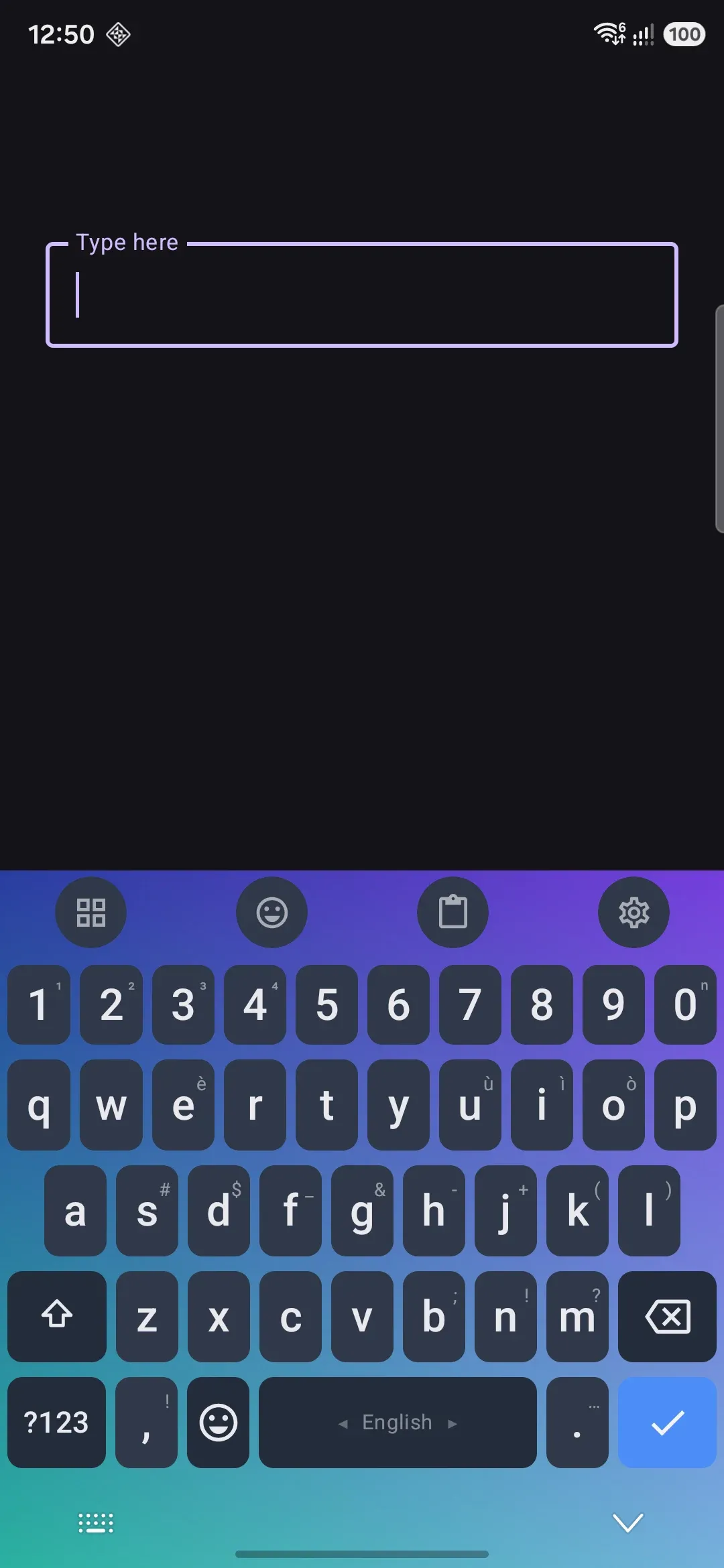
Any keyboard theme can carry a photo behind its keys instead of a flat color or gradient. You crop it to the keyboard’s shape, dial in opacity and blur so keys stay readable, and optionally swap in a different image for landscape.
This page covers a picture from your own device. A photo from Unsplash or Pexels, the collection they go into, and the background that changes on a schedule are all in Online photos and rotation.
Setting an image
Section titled “Setting an image”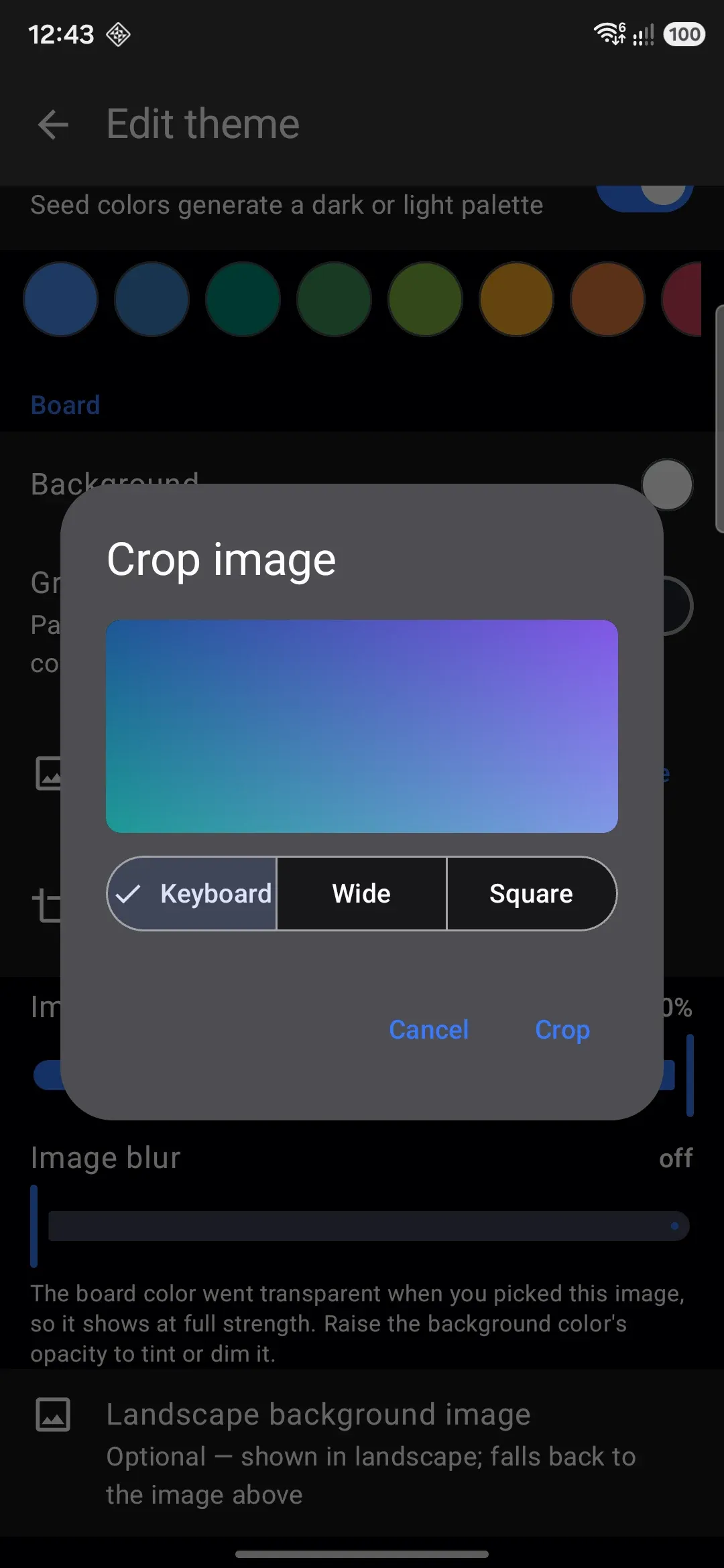
Open a theme for editing. Scroll to the Board section. Tap Background image to open the Select a background dialog. Add from this device opens the system photo picker, which offers image files only. The app copies the picture you choose into its own storage, and it never reads the original file again.
Picking an image changes two things about the theme so the photo is actually visible, both of which stay editable afterward:
- The board color’s opacity drops to zero, so the photo shows at full strength rather than being hidden under an opaque background. Raise it again if you want to tint or dim the photo.
- Fully opaque key and modifier colors drop to 62% opacity, or to whatever How solid the keys stay is set to, anywhere from 20% to 100%. A keyboard is mostly keys, so leaving them solid means the photo is only visible around the edges. Keys you had already made see-through are left alone.
See Editing a theme for both color controls.
The photo also joins your photo collection, so you can put it on another theme, or into the rotation, without finding it in your gallery again.
Cropping to fit
Section titled “Cropping to fit”Once an image is set, a Crop image row appears. In the crop dialog, pinch to zoom and drag to reposition. The image always scales to cover the frame, so there’s never a gap at the edges. Four crop ratios are available:
- Keyboard: the shape your keyboard actually has on screen, in portrait for the portrait image and in landscape for the landscape one, so the frame shows exactly what ends up behind the keys. The keyboard measures itself each time it opens, so this follows your key height, number row, toolbar and width settings. Selected by default. Until the keyboard has been opened once in that orientation, it uses 2.4:1.
- Wide (1.7:1)
- Square (1:1)
- Free: keeps the picture’s own shape. The other three are all wider-than-tall keyboard shapes, which crop a split or floating keyboard down.
Confirm the crop and the app saves the cropped picture, and keeps the uncropped one beside it. Opening Crop image again starts from the whole picture, with the frame where you left it, so you can move to a part an earlier crop cut away, or zoom back out. Cropping is optional, and an uncropped image still renders correctly, scaled to cover the board. Crop when you want to control which part of the photo lines up with the keys.
The photo grid in Online photos dims the parts of each photo outside the keyboard’s shape, using the same measured portrait shape.
Keeping keys readable
Section titled “Keeping keys readable”A photo behind your keys can easily fight with legibility, so two sliders and a switch sit right below the image row:
- Image opacity fades the image itself, from fully transparent to fully opaque (the default).
- Image blur softens the image from sharp (the default) up to a heavy blur.
- Play animated image plays the background when it’s a GIF or an animated WebP, and turns itself on when the picture you picked is one. Turning it on zeroes the blur, and raising the blur turns it off: blurring a running animation would re-render the effect on every frame. The animation also stays still under reduce motion or power saving, and on app versions from before this feature the same file shows its first frame.
There’s no separate “dim” control. The board’s own background color draws as a layer on top of the image, so raising that color’s opacity tints or dims the photo. It’s the same Background color row you’d use for a solid-color theme. A soft blur plus a translucent board color is usually enough to keep key labels legible over a busy photo.
Separate landscape image
Section titled “Separate landscape image”Below the portrait image controls, Landscape background image lets you pick a second photo (with its own crop dialog) used only when the device is in landscape orientation. If you don’t set one, the portrait image is used in landscape too. There’s no picture that only shows in portrait while landscape falls back to something else.
Opacity and blur are shared between both images rather than set per orientation, so whichever photo is showing uses the same two slider values.
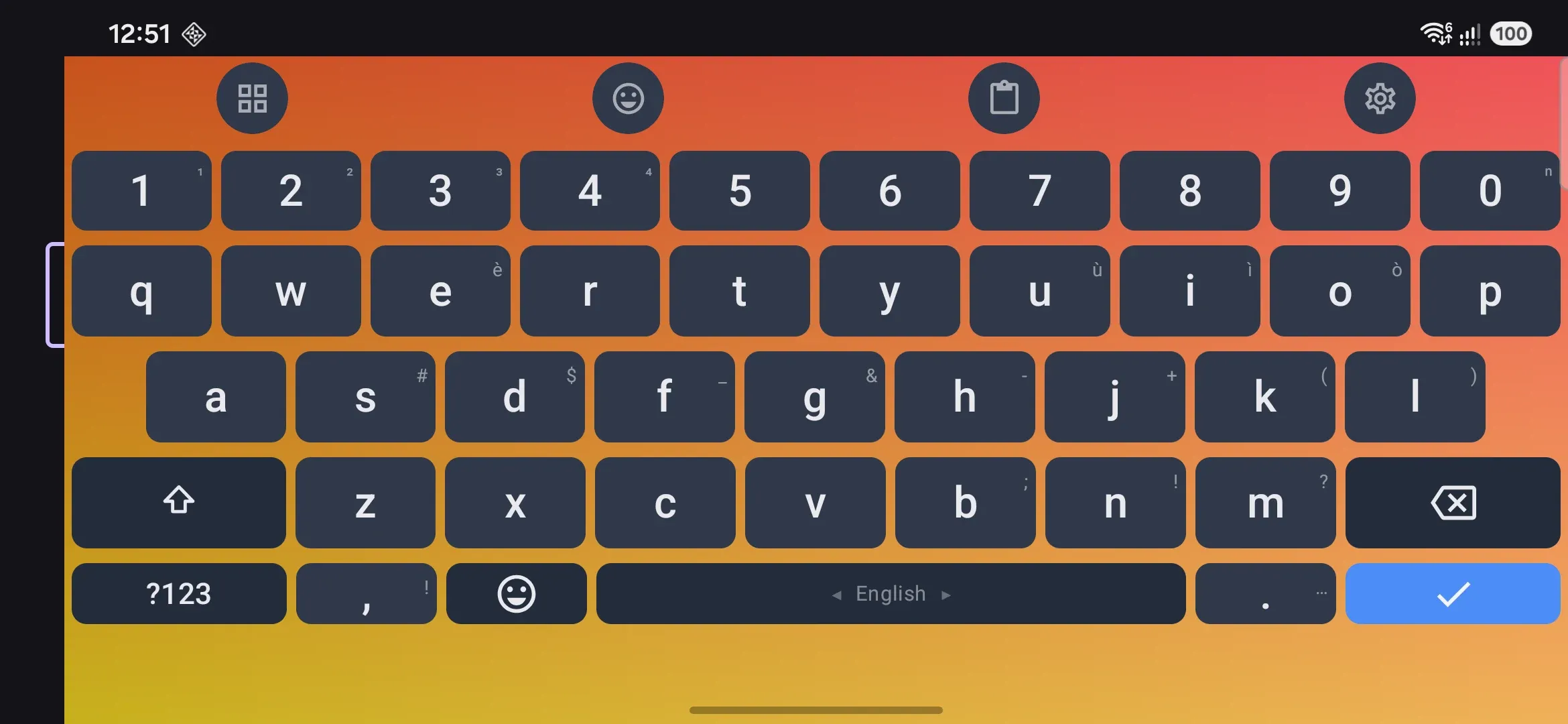
Image sizes and templates
Section titled “Image sizes and templates”If you draw a theme yourself, this screen tells you how big each picture should be before you start. It lists the background, the letter, function and Enter keys, the space bar, the pressed key, the key popup, stickers and press effect images, each with two sizes:
- On screen is what the picture covers on the keyboard.
- Draw at is the same shape, made as large as the keyboard keeps. A key image is kept at up to 256 pixels on its long side and a space bar image at up to 1024 × 320, so a larger drawing only gets made smaller again.
The sizes are measured from the keyboard itself, so they are right for your layout, number row, key height and spacing. Screen picks what they are measured for:
- This phone (the default): your own layout and sizes on this screen.
- Phone: a 1080 pixel wide phone with the default sizes. Use this for a theme you want to share, since other people see the defaults.
- Phone, landscape: the same phone on its side, for the landscape image.
- Tablet: a 1600 pixel wide tablet or an open foldable, with the default sizes.
The picture under the selector is the board template: every key’s outline over the background area, the toolbar band at the top, and the band under the navigation bar at the bottom. The background runs on under the navigation bar on Android 15 and later only, so keep that band plain.
Save board image saves that template as a PNG. Save all templates saves a ZIP with the board template, one template each for the letter key, function key, Enter key, space bar and popup (with a dashed box where the label sits), and a README.txt with every size. The templates are transparent with white lines. Put one on the top layer of your drawing, and hide it before you export.
Details and edge cases
Section titled “Details and edge cases”- No image by default. A freshly created theme, every built-in gallery theme, and the Default (system) theme all start with no background image, so the board is a flat color or gradient until you add one.
- Switching themes crossfades the rest of the theme, but not the image. Colors and gradients blend smoothly between themes. The background image switches over abruptly partway through the transition rather than cross-dissolving, since blending two unrelated photos frame-by-frame wouldn’t look right anyway. Blur switches at the same moment for the same reason.
- Changing the seed color keeps your photo visible. Picking a seed swatch, or flipping the light and dark switch, rebuilds every color in the theme. When the theme has a background image, how see-through the board and keys are is carried across, so the new palette does not bury the photo under a fresh opaque color.
- Images are decoded at the size they are drawn. A photo straight off a camera is far larger than the strip behind your keys, so the app samples it down first rather than holding it at full size.
- The gallery preview card only shows the portrait image. The small theme thumbnail in the theme list never shows the landscape variant, even if one is set.
- Background images travel with exports. Both a single-theme export and a full settings backup embed the image data directly in the file, so restoring the export or importing the theme on another device brings the photo with it; you don’t need to re-pick the image after importing. See Sharing themes for what else a theme export contains.
- This page is about a single theme’s own image. Switching between two different themes automatically by time of day or by system light/dark mode (where each half of the pair might have its own background image) is covered in Themes overview. A single theme whose photo changes on a schedule is Online photos and rotation.